
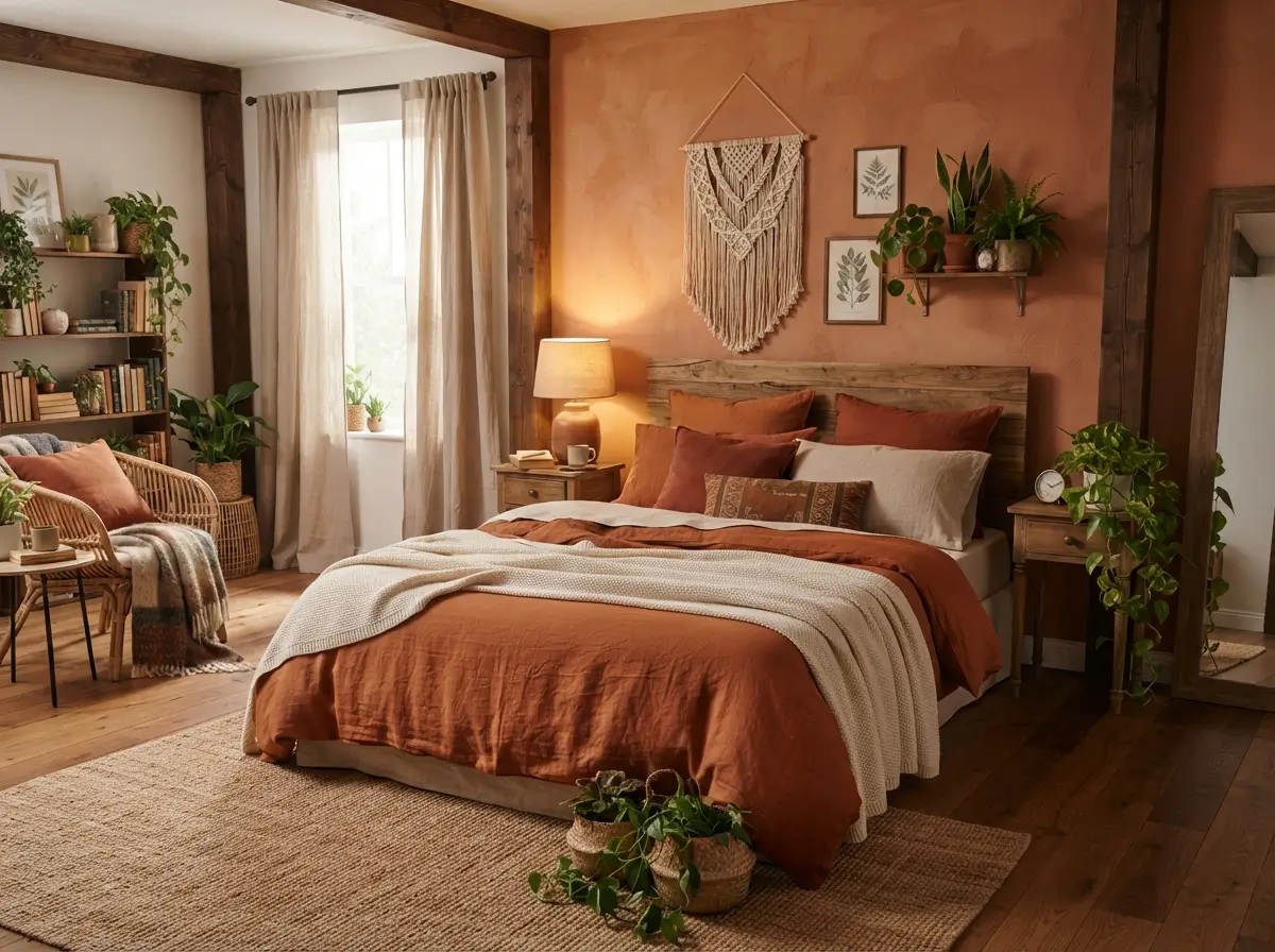

Burnt orange brings warmth without feeling sugary, cold, or overly bright. It sits comfortably beside beige, tan, walnut, olive, cream, rust, and soft black, which makes it useful for bedrooms that need more depth. A Warm Burnt Orange Bedroom can feel calm, grounded, and welcoming when the color is balanced with breathable neutrals and natural materials. Beginners often make the mistake of using too much orange at once, but the strongest rooms usually repeat it in controlled amounts across bedding, artwork, and one or two smaller details. Good lighting, sensible furniture placement, and varied textures matter just as much as the color itself.
What Is the Easiest Way to Style Burnt Orange in a Bedroom?
Start with one medium-sized feature, such as a duvet cover, upholstered headboard, painted wall, or large rug, then repeat the color in two smaller places. A Warm Burnt Orange Bedroom looks more settled when the orange appears at different heights instead of sitting in one heavy block. Keep walls or major furniture neutral unless the room receives strong daylight. Add wood, woven fibers, linen, and warm white lighting to soften the palette. Renters can create the same effect with removable wallpaper, peel-and-stick panels, framed textiles, and washable bedding rather than permanent paint.
Planning the room before shopping reduces waste. Photograph each wall in daylight, note the measurements, and list what must stay. Compare every item against that record. Clear limits on size, color, and function make it easier to reject attractive pieces that would crowd the space.
Build the Palette Around a Burnt Orange Duvet
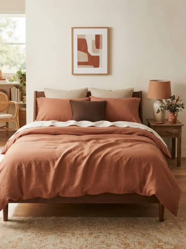
Bedding gives you the fastest route into this color scheme because it covers a large visual area without requiring paint or new furniture. Choose a duvet in muted rust, clay orange, cinnamon, or terracotta rather than a bright pumpkin shade. Pair it with warm white sheets, two beige pillowcases, and one darker accent cushion in olive, chocolate, or charcoal. Keeping the fitted sheet and most pillows pale prevents the bed from becoming a solid orange block. Linen blends, washed cotton, and matte quilts work especially well because their softened surfaces make strong color feel more relaxed.
Color placement makes this approach useful for beginners. The bed naturally acts as the main feature, so the room gains direction without extra decorative clutter. Repeat the duvet color once in a framed print and once in a small object, such as a ceramic vase or fabric lampshade. A Warm Burnt Orange Bedroom styled this way is easy to update seasonally because the largest color source can be folded away or replaced. Budget shoppers can use a neutral duvet and add a burnt orange coverlet across the lower third of the bed for a similar effect at a lower cost.
Paint One Wall in a Muted Clay Orange
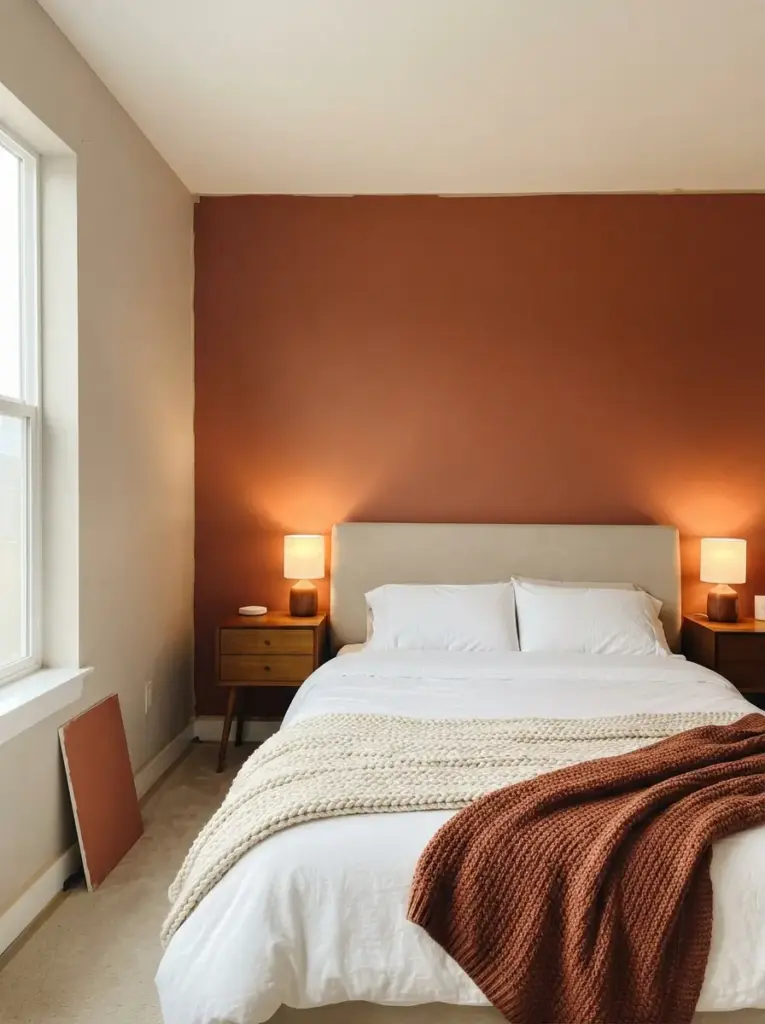
Feature walls work best when the chosen wall already has a clear purpose. Paint the wall behind the headboard if it is mostly uninterrupted, or use the wall opposite the window when natural light will reveal the color evenly. Look for shades described as baked clay, canyon, saddle, adobe, or muted terracotta. Test large samples during morning and evening because burnt orange can turn red under cool daylight or brown under weak artificial light. Matte or eggshell paint usually feels softer than a reflective finish, particularly in small bedrooms.
Visual depth explains why one painted wall can make the room feel more complete. Darker warm colors appear to move slightly forward, helping a long, narrow bedroom feel less stretched. Keep adjacent walls cream, warm greige, or soft oatmeal so the painted surface has breathing room. People with compact rooms should avoid painting every wall unless the space receives generous daylight. Renters can cover a large foam board or lightweight plywood panel with removable wallpaper and place it behind the bed, creating a similar focal area without touching the wall.
Before painting, mark the proposed area with painter’s tape and view it from the doorway, bed, and main walking path. This quick test shows whether the feature wall will feel balanced with the wardrobe and windows. Rooms with low ceilings often suit a full-width wall better than a painted arch, while narrow beds can benefit from a color block extending 12 to 18 inches beyond each side. Keep electrical outlets, switches, and wall vents visible during planning so the finished section does not look awkwardly cut.
Pair Burnt Orange with Warm White Walls
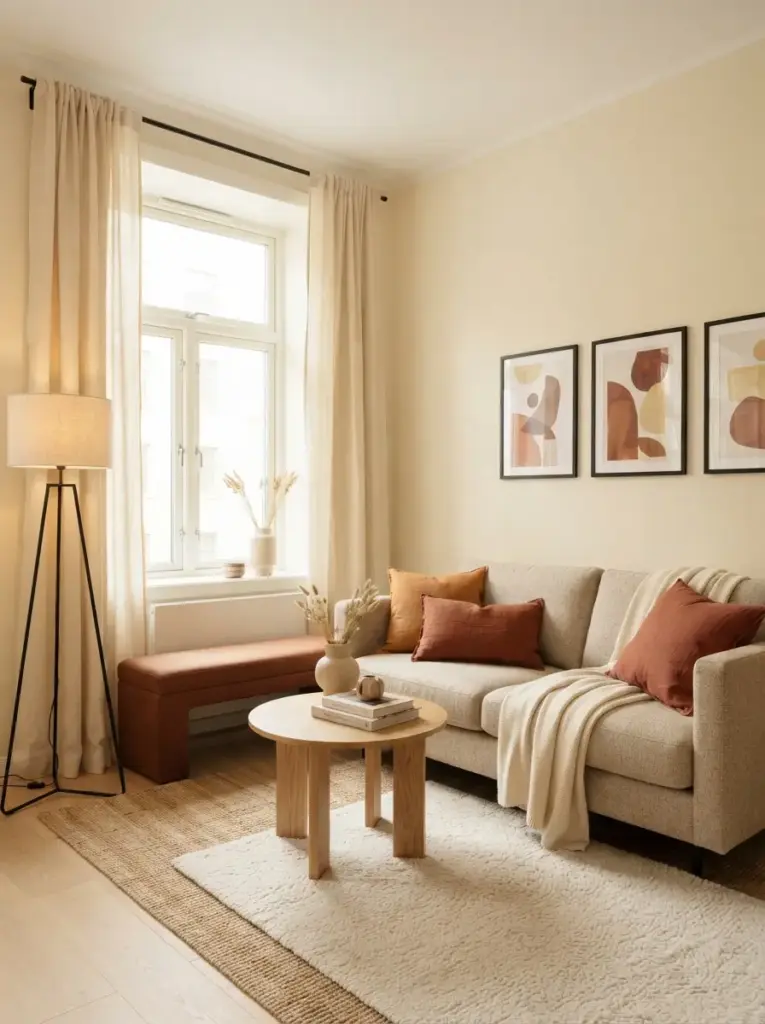
Warm white creates a cleaner background than stark white and allows earthy orange tones to look rich rather than harsh. Select paint with beige, cream, or faint yellow undertones, especially when the room faces north or receives limited light. Cool blue-white walls can make rust-colored fabrics look muddy by comparison. Examples of useful supporting shades include ivory, bone, parchment, linen, and soft cream. Carry the wall color into curtains or larger storage pieces to keep the outline of the room quiet.
Contrast control makes this pairing dependable for small spaces. Pale walls reflect daylight, while burnt orange adds warmth in concentrated areas such as the bed, bench, or artwork. Use black sparingly through a curtain rod, slim lamp base, or frame to sharpen the scheme. Avoid adding too many separate beige tones with noticeably different undertones, because the room may look mismatched rather than layered. Anyone decorating a first apartment can start with existing white walls and use cream textiles to warm them visually without repainting.
Add a Walnut or Medium-Oak Headboard
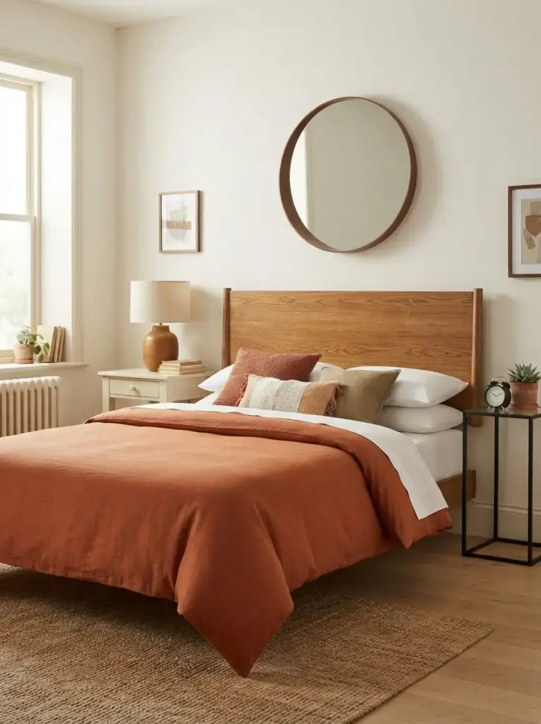
Wood connects burnt orange to the broader earthy palette and stops the color from feeling like a temporary seasonal choice. Walnut brings deeper brown notes that suit dramatic rooms, while medium oak feels lighter and works well in smaller spaces. Choose a simple slatted, panelled, or softly curved headboard instead of a heavily carved design if the bedding already has strong color. Leave enough visible wall around the headboard so the wood grain can be read clearly, rather than blending into the surrounding furniture.
Material harmony gives this combination its strength. Orange contains red and yellow warmth, and natural wood repeats those undertones in a subtler form. Match bedside tables loosely rather than exactly; a walnut headboard can sit beside painted cream tables, woven stools, or slim black metal stands. Small-room decorators should consider a wall-mounted headboard to save floor space. Secondhand wooden headboards are often inexpensive, and a light sanding followed by furniture oil can improve them without changing their character.
Placement matters as much as material. Center the headboard on the usable bed wall rather than automatically centering it between every architectural feature. Off-center windows, radiators, or built-in shelves may require a slightly shifted layout. Leave enough room for bedside access and make sure wall-mounted pieces are fixed into suitable anchors. Bedrooms shared by two people usually need landing space on both sides, while a single sleeper can place the bed closer to one wall and use a wider table on the open side.
Use Olive Green as the Supporting Accent
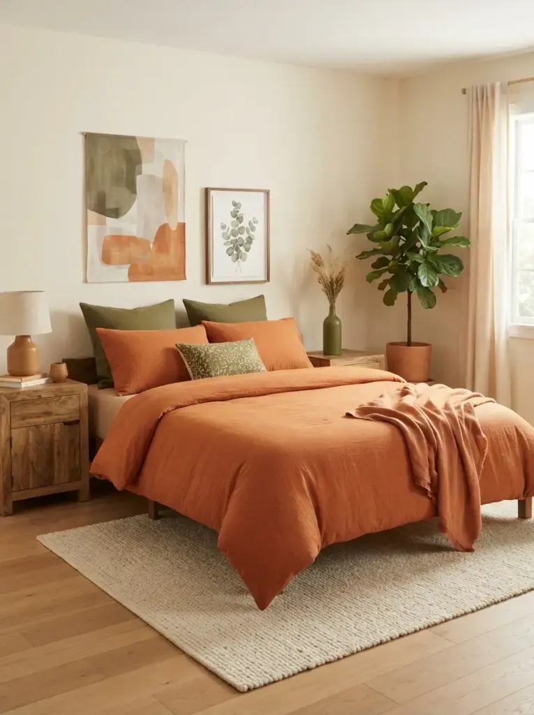
Olive green balances burnt orange because the colors feel connected to leaves, soil, dried grasses, and natural landscapes. Keep one color dominant and the other secondary. For example, use orange bedding with olive cushions, or choose an olive bedspread with a rust-colored throw. Cream walls and wood furniture can sit between them as visual resting points. Avoid using equally strong amounts of orange and green on every surface, which may make the room feel themed rather than calm.
Natural contrast helps the palette feel lively without relying on bright colors. Olive carries enough grey or brown to remain restful, while orange contributes warmth. Plants can reinforce the green note, but artificial greenery is better than struggling plants in a dark room. Anyone who prefers a quieter bedroom can use sage instead of olive, then introduce deeper green through one small cushion or artwork detail. Budget-friendly options include olive pillow covers, thrifted glass bottles, and botanical prints placed in existing frames.
Layer Linen, Cotton, Wool, and Woven Fibers
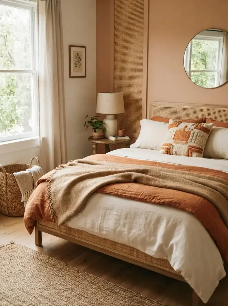
Texture prevents an earthy bedroom from looking flat when the color palette stays controlled. Combine smooth cotton sheets, a crinkled linen duvet, a wool-blend throw, and one woven cushion. Keep most surfaces matte because glossy orange fabrics can appear louder and less restful. Natural-fiber baskets, cane panels, and jute details also add texture, but use them selectively so the room does not become overly rustic. Two or three clear material changes are usually enough.
Tactile variation makes similar colors easier to distinguish. Cream linen, tan wool, and burnt orange cotton may sit close in tone, yet their surfaces create separation. People with allergies or sensitive skin can choose washable cotton and linen-look fabrics instead of rough jute near the bed. Small bedrooms benefit from texture more than extra accessories because layered fabric adds interest without taking up floor space. Try a woven bed runner, a single boucle cushion, or a textured lampshade before buying additional furniture.
Choose Lighting Between 2700K and 3000K
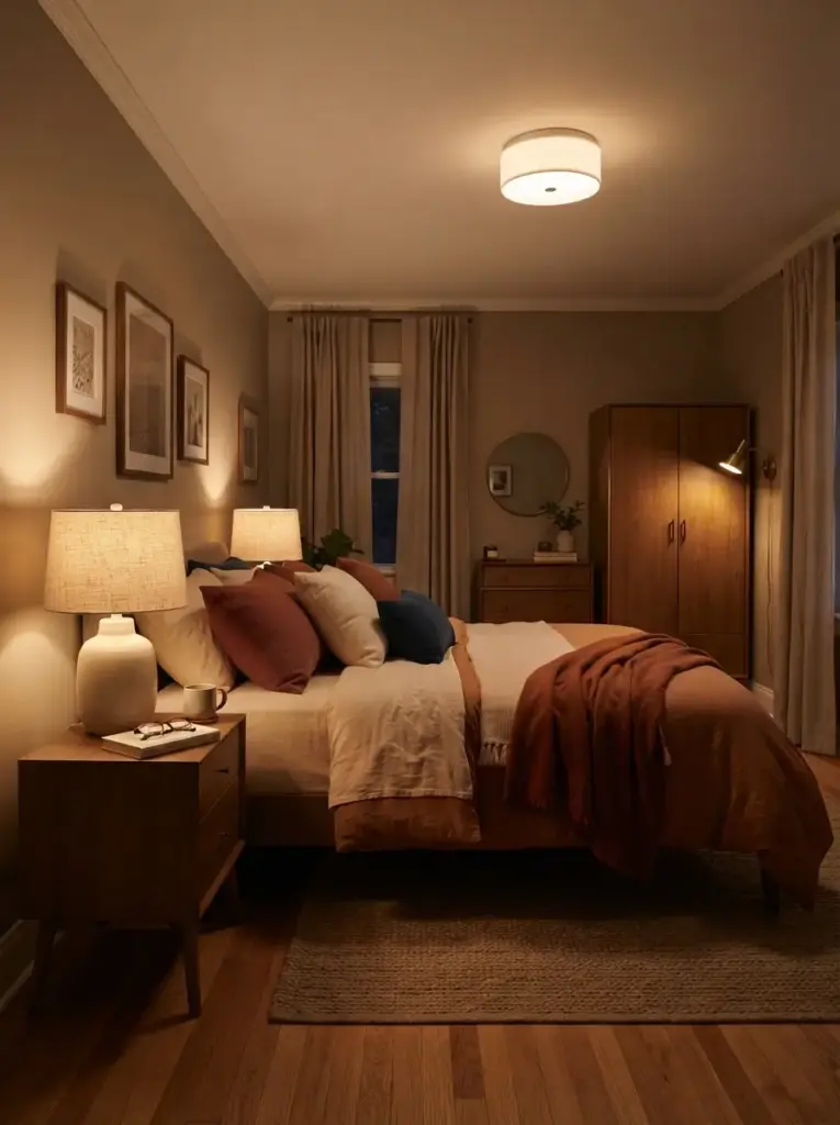
Warm bulbs support earthy colors and make burnt orange appear softer after sunset. Aim for 2700K in bedside lamps and around 3000K in a ceiling fixture if you need clearer general lighting. Bulbs below 2400K may make the room too amber, while cool 4000K bulbs can drain warmth from the palette. Use at least two light sources so the room does not depend on one bright ceiling light. A lamp on each side of the bed also improves symmetry and supports reading.
Layered lighting improves both comfort and color accuracy. Overhead light handles cleaning and dressing, while bedside lamps create a calmer evening setting. Add a small directional lamp near a wardrobe or desk when the room has a dark corner. Renters can use plug-in wall sconces with cord covers instead of hardwired fittings. Select linen, paper, ceramic, or frosted glass shades because they spread light more gently than bare bulbs and shiny metal reflectors.
Brightness also needs attention. Bedside lamps often work well with 450 to 800 lumens, depending on shade thickness and reading needs, while the ceiling fixture should provide enough general light for cleaning and dressing. Dimmers are useful, but compatible bulbs and switches are essential to prevent flickering. Place switches within easy reach of the bed where possible. Anyone sensitive to glare should choose opaque or diffused shades and avoid exposed-filament bulbs at eye level, even when the bulb itself has a warm color temperature.
Ground the Bed with a Neutral Textured Rug
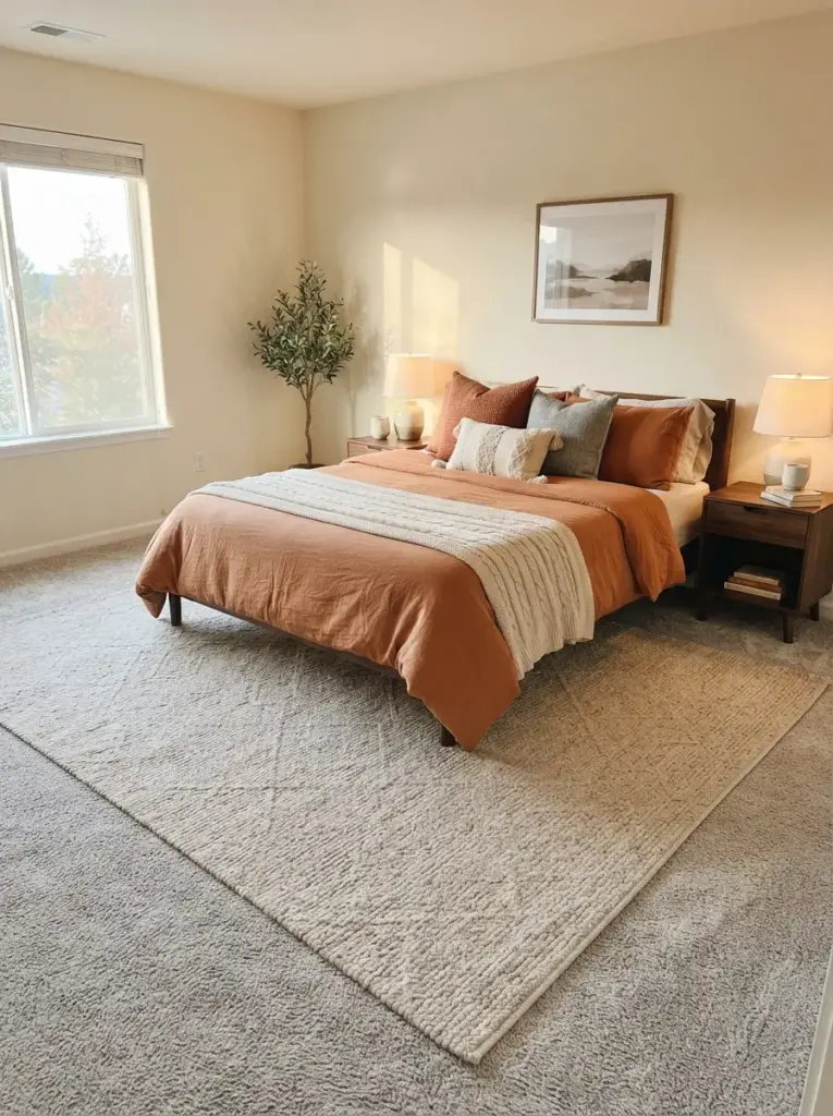
Rugs help connect orange bedding to the floor, particularly when the room has grey carpet, pale laminate, or cold-looking tile. Choose cream, oatmeal, tan, or faded brown with a subtle woven pattern. For a queen bed, place a rug large enough to extend beyond both sides and the foot, or use two narrow runners when a larger rug is outside the budget. Avoid tiny rugs floating at the foot of the bed because they can make the layout look disconnected.
Scale is the reason this idea succeeds. A properly sized rug visually gathers the bed and nightstands into one zone, making the room feel planned. Low-pile wool, flatweave cotton, and washable synthetic blends are practical choices depending on budget and cleaning needs. A room with dark wood furniture may benefit from a lighter rug, while pale furniture can handle a medium tan or faded geometric design. Apartment dwellers should add a non-slip pad to improve comfort and reduce movement.
Introduce Burnt Orange Through Curtains
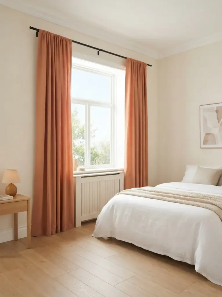
Curtains placed at full room height, which can make a low or narrow bedroom feel more balanced. Choose cotton, linen-look, or velvet panels depending on the mood and light control needed. Muted orange curtains work best with pale walls and simple bedding, while patterned curtains suit rooms where the bed stays mostly neutral. Hang the rod several inches above the window and extend it beyond the frame so the glass appears wider and more daylight enters when the curtains are open.
Vertical color creates a stronger architectural effect than a collection of small orange accessories. Bedrooms with low ceilings benefit from panels that nearly touch the floor, because long lines draw the eye upward. Velvet can feel heavy in a compact room, so reserve it for spaces with good light or use it only on one window. Renters can choose tension rods, no-drill brackets, or removable hooks where suitable. Budget curtains can look more finished when hemmed to the correct length and steamed before hanging.
Keep Storage Visually Quiet
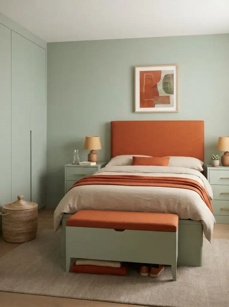
Strong color works better when everyday clutter has a clear place to go. Use closed bedside drawers, under-bed boxes, lidded baskets, and a simple wardrobe rather than filling every wall with open shelves. Match large storage pieces to the wall color where possible, which helps them recede. Burnt orange can then appear through selected textiles and artwork instead of competing with packaging, cables, and mixed household items.
Calm backgrounds make warm colors feel intentional. Clutter introduces many unrelated colors and shapes, weakening the earthy palette even when the main furniture is attractive. Small-space decorators should prioritize furniture with more than one function, such as a storage bed, a bench with a hinged lid, or a nightstand with drawers. Keep the top of each bedside table mostly clear, leaving room for a lamp, water, and one personal item. Decorative baskets are useful only when they solve a real storage need.
Storage placement should follow a routine. Keep sleepwear, chargers, and reading items near the bed; place daily clothes close to the dressing area; and store occasional bedding under the bed or on a high shelf. Label matching boxes inside wardrobes so the calm exterior does not hide a frustrating system. Open baskets work for items used frequently, but lidded containers control visual noise better. People in shared bedrooms should divide drawers or shelves clearly to prevent one person’s belongings from spreading across every available surface.
Add Black Details in Small Amounts
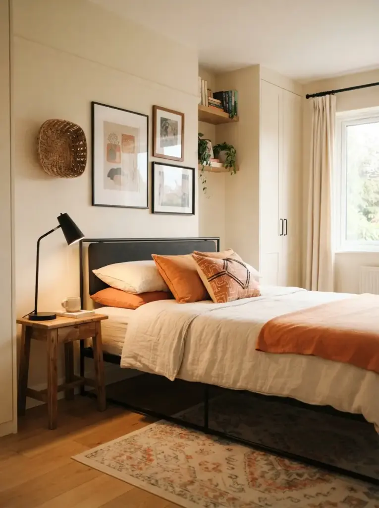
Soft black or charcoal gives the palette definition and prevents a cream-and-orange room from becoming overly blended. Use it through narrow frames, a metal bed base, cabinet handles, a lamp stem, or one patterned cushion. Keep these dark elements thin and repeated rather than placing one large black object in the middle of the room. Matte finishes suit the earthy character better than high-gloss black furniture.
Fine contrast helps the eye understand the edges of furniture and artwork. Dark lines can make warm neutrals look cleaner and more deliberate, especially in modern or industrial rooms. People with very small bedrooms should limit black to lightweight outlines, since bulky dark furniture absorbs visual space. Existing pieces can be updated with removable black hardware, a dark tray, or inexpensive frames. Avoid combining black, dark brown, and deep grey in equal quantities unless the room has strong daylight.
Create a Calm Gallery Wall with Earthy Art
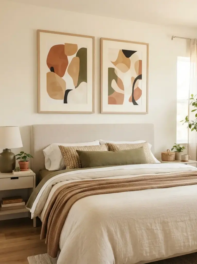
Artwork can repeat the color scheme without forcing every textile to match. Choose landscapes, abstract shapes, botanical sketches, pottery studies, or architectural prints containing clay, tan, olive, cream, and restrained black. Two larger pieces usually look calmer than many tiny frames above a bed. Keep frame finishes consistent, such as pale wood, walnut, or matte black, and leave a clear gap between the artwork and the headboard.
Repeated color makes the room feel connected from the wall to the bed. Art is also useful for renters because it introduces a large amount of visual interest without paint. Removable picture strips suit lightweight frames, while a framed fabric panel can fill more space for less money. People decorating on a budget can use public-domain art, personal photographs of landscapes, or pressed leaves. Avoid placing glass-heavy frames directly over the pillow area in homes where secure wall fixing is uncertain.
Try a Tonal Orange Scheme with Care
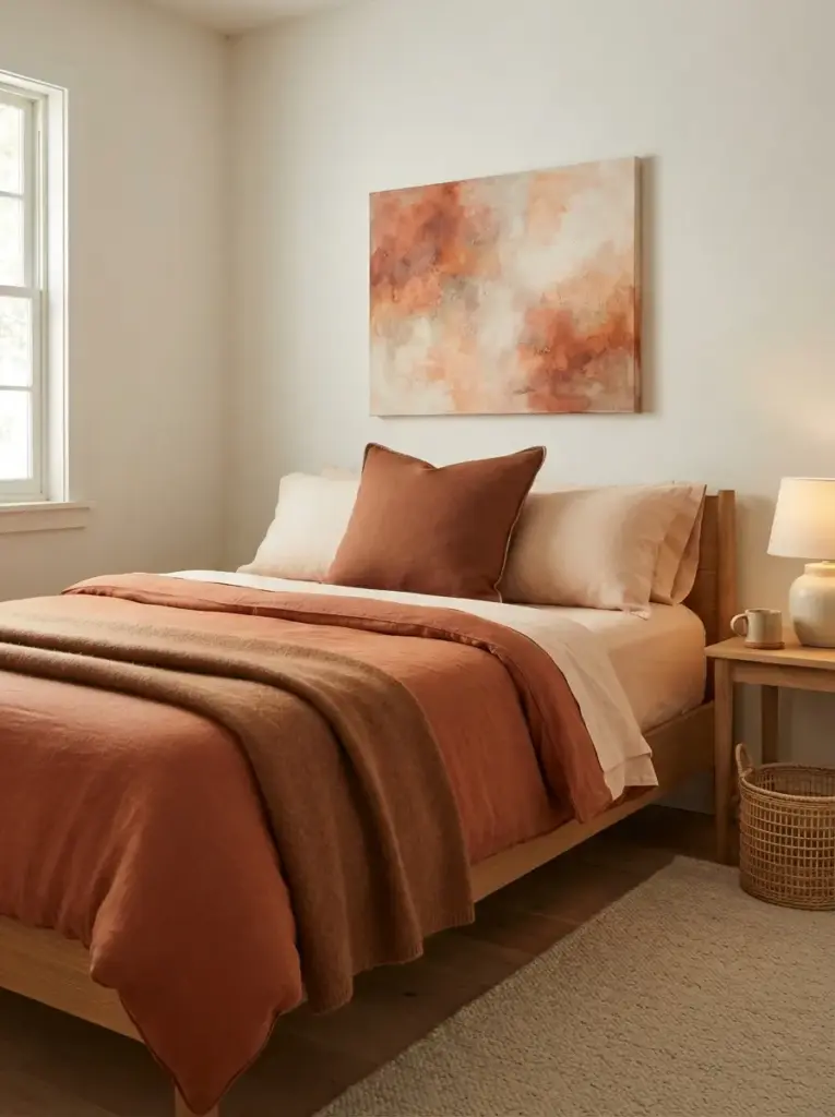
Tonal styling uses several related oranges rather than one exact shade. Combine burnt orange with pale apricot, clay, rust, cinnamon, and brown-red, then separate them with cream or tan. Keep the largest surfaces muted and reserve the deeper shades for cushions, piping, or artwork. Using different textures is essential because closely related colors can otherwise merge into one flat block.
Controlled variation gives tonal rooms depth while preserving warmth. The approach suits people who genuinely enjoy color and do not want green, blue, or black accents. Start with three orange-based shades rather than six, and test them together in daylight. A pale peach sheet, rust duvet, and deep clay cushion can be enough. Small bedrooms need extra neutral space around the palette, so keep walls light and choose a simple floor treatment. Avoid bright tangerine, neon coral, or glossy copper unless you want a much bolder result.
Use Removable Wallpaper Behind the Bed
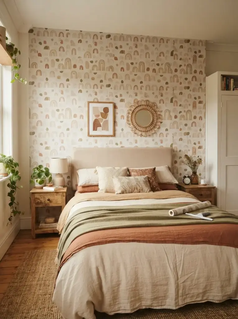
Peel-and-stick wallpaper can create a strong focal area without permanent paint. Look for designs with small-scale geometrics, faded botanicals, abstract arches, or hand-drawn stripes in clay, cream, tan, and olive. Cover the entire wall behind the bed for the cleanest effect, or apply wallpaper inside a wide framed section to reduce cost. Measure carefully, order a little extra for pattern matching, and test adhesion on a hidden area first.
Pattern introduces movement while the earthy colors keep it manageable. Renters benefit most from this approach, although wall condition matters because fragile paint may lift during removal. People with compact rooms should avoid oversized, high-contrast prints that can dominate the bed. Removable wallpaper also works on the back panel of a bookcase, wardrobe doors, or a lightweight screen. Smooth the paper slowly with a felt squeegee to reduce bubbles, and do not install it immediately after walls have been painted.
Add a Small Upholstered Bench or Accent Chair
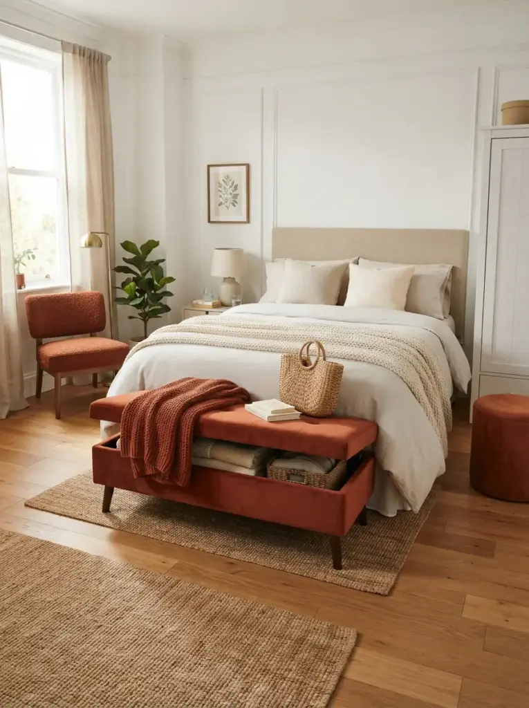
Seating can provide one final orange statement while making the bedroom more functional. Place a slim bench at the foot of the bed so that at least 30 inches of walking space will remain. In tighter rooms, use a compact chair near a window or a small upholstered stool beside a wardrobe. Choose rust velvet, textured chenille, woven cotton, or faux suede, then keep the surrounding bedding comparatively simple.
Function supports the decorative choice here. A bench gives you a place to sit while dressing, lay out clothes, or set down a bag, so it earns its floor space. Storage benches are useful in small homes, but check that the lid opens without hitting the bed. Anyone working with a limited budget can re-cover a secondhand stool or chair seat using durable upholstery fabric. Avoid large lounge chairs in bedrooms where they block drawers, doors, or the natural path around the bed.
Common Mistakes to Avoid
Using Too Much Orange on Every Surface
Covering walls, bedding, curtains, rugs, and furniture in the same strong orange removes contrast and can make the room feel smaller. Select one dominant orange feature, two supporting details, and several quiet surfaces. Cream, tan, wood, and muted green provide rest for the eye. People who want more color should vary both shade and texture instead of repeating one exact tone everywhere.
Choosing the Wrong Undertone
Burnt orange can lean red, brown, yellow, or even pink. Place samples beside your flooring, wood furniture, and wall color before buying large items. Red-leaning rust may clash with orange-toned pine, while brown-based clay usually sits more easily with many woods. Cool grey walls often need cream textiles between them and the orange to prevent the palette from feeling disconnected.
Ignoring Natural and Artificial Light
Color changes throughout the day, so judge fabric and paint under morning light, afternoon light, and your usual evening bulbs. North-facing rooms may need lighter clay tones and extra lamps. Bright south-facing rooms can handle deeper rust or terracotta. Ordering several fabric swatches is usually cheaper than returning a full duvet, rug, or curtain set that looks wrong after sunset.
Buying Decor Before Planning the Layout
Accessories cannot fix a blocked walkway, oversized bed, or badly placed storage unit. Measure the bed wall, door swing, drawer clearance, and route to the wardrobe before adding a bench, chair, or extra table. Leave a comfortable walking space on the side used most often. In tiny bedrooms, one functional nightstand and a wall-mounted light may work better than forcing symmetry.
Mixing Too Many Design Styles
Earthy color can work with modern, bohemian, rustic, mid-century, and traditional furniture, but using all those styles at once creates noise. Choose one main direction and one supporting influence. For example, pair a simple modern bed with woven textures, or combine a vintage wooden dresser with clean bedding. Repeating the same wood tone or metal finish can help unrelated pieces feel connected.
Budget-Friendly Ways to Get the Look
Begin with textiles because they provide the most visible change for the least disruption. A rust throw, two cushion covers, and a small framed print can shift a neutral room without replacing furniture. Shop your home first for cream bedding, brown baskets, black frames, and wooden objects that already fit the palette. Moving suitable pieces between rooms often produces a more coordinated result than buying several low-cost decorations at once.
Secondhand furniture can add character while keeping spending controlled. Search for wood headboards, bedside tables, stools, benches, and ceramic lamps with useful proportions rather than focusing only on finish. Light sanding, furniture oil, new handles, or a simple fabric seat can make a worn piece feel intentional. Check stability, drawer movement, odors, and signs of pests before bringing upholstered or wooden furniture indoors.
Paint remains one of the strongest low-cost tools when permanent changes are allowed. Instead of coating every wall, paint a headboard shape, a wide arch, or a rectangular block behind the bed. Sample pots may cover a small design, while leftover paint can update a stool or narrow shelf. Clean lines matter more than complexity, so use a level and quality painter’s tape.
Rental-friendly decorating should rely on removable layers. Use peel-and-stick wallpaper, tension rods, plug-in sconces, washable rugs, framed fabric, and adhesive hooks rated for the item’s weight. Keep original hardware in a labelled bag if you replace knobs or handles. Test removable products in hidden areas, since paint condition and humidity affect how cleanly they come off.
Spending priorities should follow daily use. Put more of the budget into bedding, lighting, and storage because those choices affect comfort and function. Save on small accessories by using books, pottery, baskets, and artwork you already own. One well-sized rug or reliable bedside lamp usually improves the room more than several trend-led objects that add clutter.
Warm Burnt Orange Bedroom Tips
Balance color across the room rather than concentrating every orange item on the bed. One feature at bed height, one element on the wall, and one smaller detail near the floor usually create enough repetition. Keep exact matching to a minimum; natural palettes look more convincing when rust, clay, tan, and brown vary slightly. Carry a fabric swatch or clear daylight photo when shopping so new items relate to what you already own.
Scale each choice to the room. Large bedrooms can handle a painted wall, substantial headboard, wide rug, and deeper curtains. Compact rooms often look better with pale walls, a rust coverlet, slim furniture, and wall-mounted lighting. Measure before buying and protect clear walkways. Furniture that blocks movement will make even a beautiful palette feel uncomfortable.
Lighting deserves early attention rather than being treated as a final accessory. Use warm bulbs, place lamps where you actually read or dress, and avoid relying only on one ceiling fixture. Mirrors can help distribute daylight when placed beside or opposite a window, but do not aim them directly at a cluttered shelf. Soft shades, dimmable bulbs, and warm pools of light support the earthy character after dark.
Frequently Asked Questions
What colors go best with burnt orange in a bedroom?
Cream, warm white, beige, tan, walnut, olive, sage, chocolate brown, and small amounts of charcoal work especially well. Choose two or three supporting colors rather than using the entire list. Pale neutrals make the room feel lighter, while darker woods and greens add depth. Cool blue can work as a contrast, but dusty or greyed blue usually feels more settled than bright navy or turquoise.
Is burnt orange suitable for a small bedroom?
Burnt orange works well in a small room when used in controlled areas. Keep the walls light, choose furniture with slim outlines, and introduce orange through bedding, one curtain panel set, artwork, or a compact upholstered stool. Avoid filling every large surface with deep color. Good storage and clear floor space matter more than avoiding warm shades altogether.
Which wall should be painted burnt orange?
The wall behind the headboard is usually the safest choice because it already acts as the room’s focal point. A short end wall can also help a long bedroom feel better proportioned. Avoid choosing a wall crowded with doors, wardrobes, or several small windows, since interruptions weaken the effect. Always test the paint under the room’s real lighting before covering the full surface.
Can burnt orange work with grey furniture?
Grey furniture can work, especially when the grey has warm or taupe undertones. Add cream, beige, or natural wood between grey and orange to connect the palette. Cool silver-grey furniture beside strong rust may feel disconnected, so soften it with warm bedding, a tan rug, and wooden or brass details. Limit extra cool colors unless you want a sharper contemporary scheme.
How can renters create the look without painting?
Renters can use burnt orange bedding, curtains, removable wallpaper, framed textiles, plug-in wall lights, rugs, and upholstered stools. Large fabric panels hung behind the bed can imitate the visual weight of a painted wall. Adhesive products should be tested first, and weight limits must be followed. Keeping receipts and original hardware makes moving or restoring the room easier.
How do I keep the room from looking too autumnal?
Reduce seasonal references such as leaf prints, pumpkins, and orange-brown plaid. Pair burnt orange with cream, olive, black, pale wood, or simple abstract art instead. Clean furniture lines and plain textiles make the color feel suitable throughout the year. A Warm Burnt Orange Bedroom can remain fresh in spring and summer when lightweight linen, greenery, and brighter natural light balance the deeper shade.
Conclusion
Burnt orange works best when it supports the room rather than taking control of every surface. Start with one clear feature, repeat the color in two smaller places, and surround it with warm neutrals, wood, useful storage, and layered lighting. A Warm Burnt Orange Bedroom should still function well for sleeping, dressing, reading, and moving around comfortably. Measure carefully, test colors in real light, and invest first in items you touch every day. With thoughtful balance, even a small or rented bedroom can gain warmth, depth, and earthy character without feeling crowded or overly themed.