
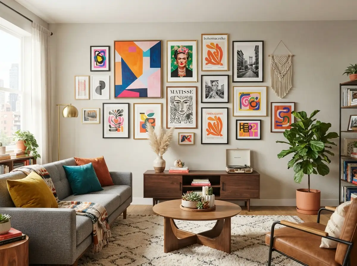

Blank walls can make even a well-furnished apartment feel unfinished. Furniture may be comfortable, lighting may be warm, and colors may coordinate, yet the room can still lack character when the walls have no visual focus. Apartment Wall Art solves that problem by adding scale, color, rhythm, and personality without taking up floor space. It can also help a small room feel more balanced because the eye has somewhere intentional to rest.
Good wall styling does not require expensive originals or permanent changes. Renters can create strong displays with removable hooks, lightweight frames, fabric hangings, peel-and-stick mounting strips, and carefully planned layouts. Beginners also benefit from starting with the furniture already in the room. A sofa, bed, dining table, desk, or media console provides a natural anchor for deciding where artwork should go and how large it should be.
What Wall Art Makes an Apartment Look Better?
Apartment Wall Art looks best when its size, colors, and placement respond to the room instead of competing with it. Large pieces work well above sofas and beds, small groupings suit narrow walls, and calm prints help busy rooms feel settled. Choosing art that repeats two or three colors already found in rugs, cushions, curtains, or furniture creates a connected look without making the room feel overly matched.
Plan the Wall Before Buying Artwork
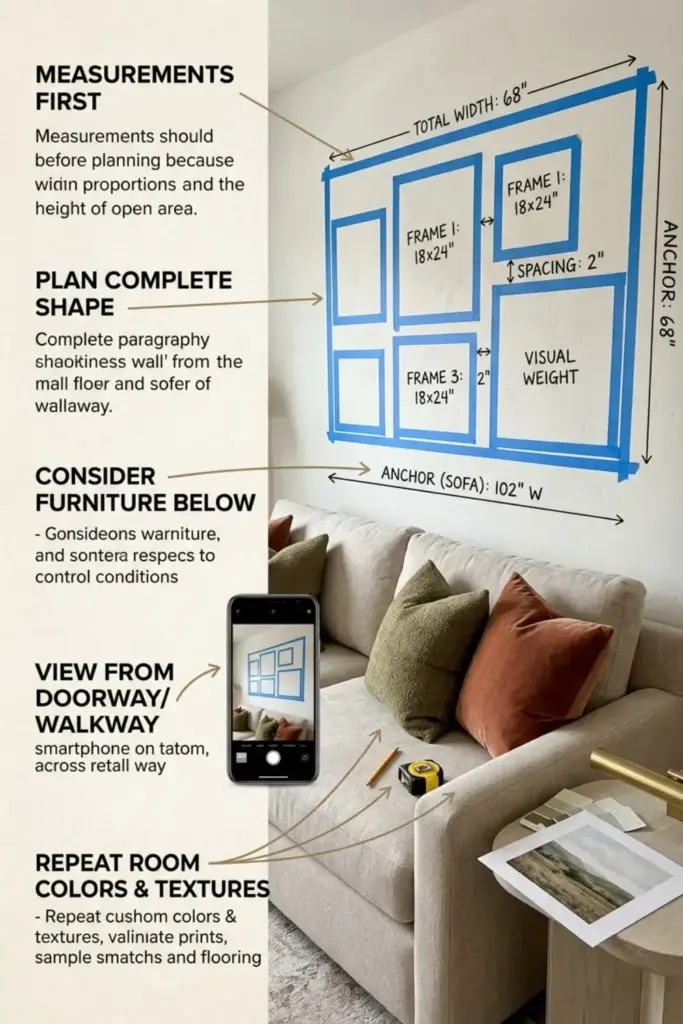
Measurements should come before shopping because a beautiful print can still look wrong when its proportions do not fit the wall. Record the width and height of the open area, then measure the furniture beneath it. Mark possible artwork dimensions with painter’s tape and view the outline from the doorway, sofa, and nearby walkway. Photos taken on a phone can also help because the camera reveals an imbalance that may be less obvious while standing close to the wall. For a single piece of furniture above, begin with a width near two-thirds of the sofa, bed, console, or table. Grouped displays should be measured as one complete shape, including the spaces between frames. Planning in this order prevents buyers from collecting several small pieces and later discovering that the arrangement lacks enough visual weight.
The room function should influence the subject, contrast, and level of detail. Living rooms can support bolder shapes because people usually view the wall from several feet away, while bedrooms often benefit from calmer imagery and softer contrast. Home offices need artwork that adds personality without distracting from screens or video calls. Dining areas can handle stronger colors, graphic forms, food photography, or landscape scenes, particularly when the furniture is simple. Entryways usually provide less viewing distance, making medium prints, mirrors, and narrow vertical arrangements more practical than oversized, detailed canvases. Apartment Wall Art should also respond to daily movement. Frames near doors, chairs, or narrow passages need enough clearance to avoid bumps, while pieces above beds and sofas require secure mounting for safety.
Existing finishes provide a useful color guide. Look at the largest items first, including flooring, sofa fabric, curtains, bedding, cabinets, and rugs. Select artwork that repeats two or three colors from those surfaces, then introduce one controlled contrast for energy. A room with beige upholstery, walnut furniture, and olive cushions could support prints containing cream, brown, green, and a small amount of burnt orange. Cool gray furniture may look warmer beside art with muted terracotta or tan, while a colorful rug often needs simpler black-and-white imagery above it. Frame finish matters too. Pale wood blends with light interiors, black adds definition, white feels quiet, and brass brings warmth. Testing samples beside the wall during daylight and evening lighting helps prevent colors from appearing unexpectedly dull, blue, yellow, or overly intense after installation.
Choose One Oversized Piece Above the Sofa
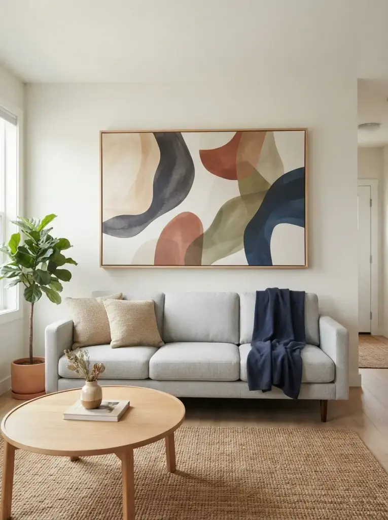
One large artwork can make a living room feel organized faster than several small pieces placed without a plan. Aim for a width that covers roughly two-thirds of the sofa, because anything much narrower may look disconnected from the furniture below it. A 72-inch sofa, for example, usually works well with artwork between 44 and 52 inches wide. Hang the piece so its lower edge sits around 6 to 10 inches above the sofa back, keeping the artwork visually connected to the seating area.
Oversized artworks create a clear focal point and reduce visual clutter. Soft abstract shapes in warm beige, charcoal, muted rust, olive, or navy suit many apartments because those colors pair easily with neutral upholstery. Renters should choose lightweight canvas, framed fabric, or a large unframed print mounted with removable strips rated for the correct weight. This idea is best for people who prefer a clean room with fewer decorative objects, especially when the sofa faces the entrance and becomes the first major feature visitors notice.
Build a Balanced Gallery Wall
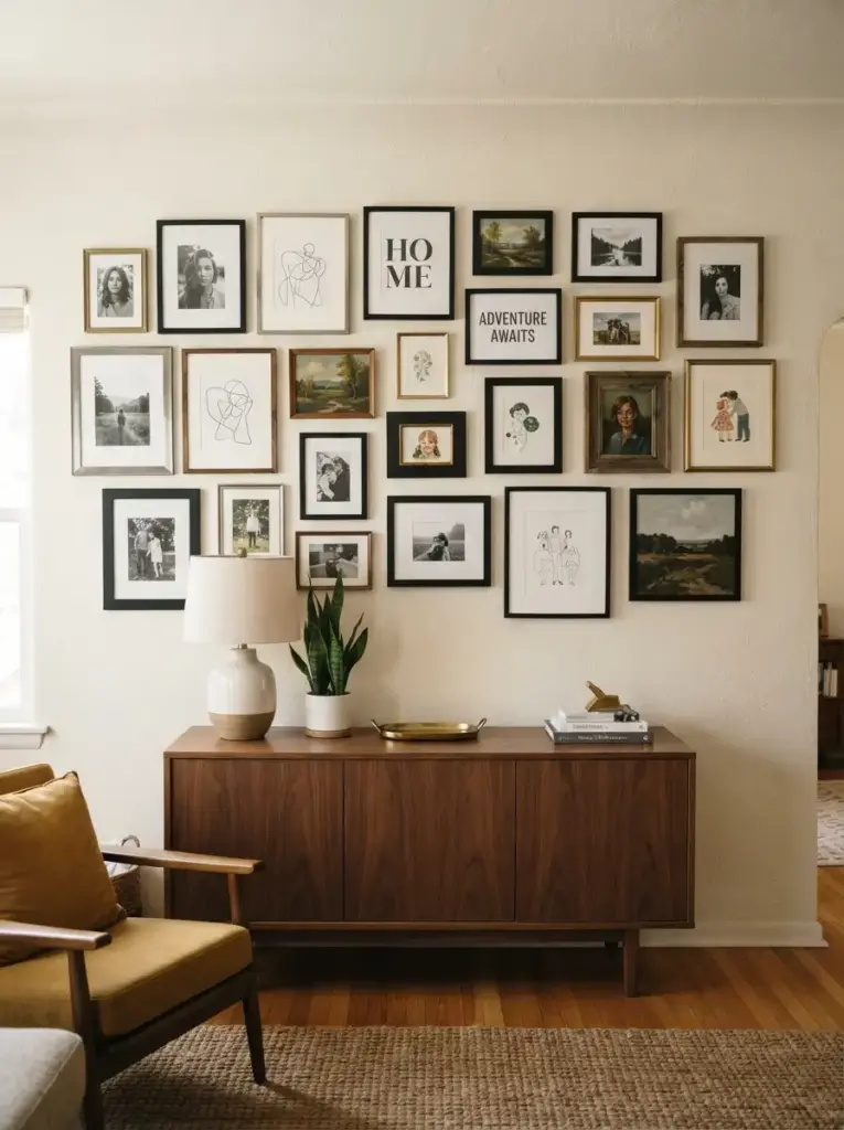
Gallery walls bring energy to a plain room, but successful arrangements depend on spacing and structure. Start by choosing one visual rule, such as matching black frames, similar wood tones, or a shared color palette. Lay every piece on the floor before mounting anything, then keep 2 to 3 inches between frames. Tighter spacing makes separate pictures read as one composition, while large gaps can make the arrangement feel scattered.
Balanced groupings work because repeated shapes guide the eye across the wall. Mix photographs, line drawings, typography, small paintings, and postcards, but avoid using too many unrelated frame colors. A simple nine-frame grid suits modern rooms, while an uneven arrangement feels more relaxed in eclectic spaces. Beginners can trace frames onto paper, tape the paper templates to the wall, and adjust the layout without making holes. This approach is ideal for renters, collectors, and anyone who wants to display personal memories without buying a costly statement piece.
Frame Textiles for Soft Color and Texture
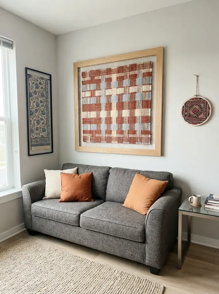
Fabric can become striking wall decor when placed inside a simple frame or stretched over a lightweight panel. Scarves, block-printed cloth, woven placemats, embroidered pieces, and vintage fabric remnants often cost less than framed art while adding richer texture. Choose a textile with colors already present in the room, then place it behind acrylic rather than heavy glass if weight is a concern.
Textile art succeeds because soft fibers balance hard apartment surfaces such as painted drywall, metal furniture, laminate flooring, and glass tables. A rust-and-cream woven panel can warm a gray sofa, while indigo fabric can add depth to a white bedroom. Wide natural wood frames suit relaxed interiors, and slim black frames create a cleaner contemporary effect. People decorating on a budget will find this option especially useful because fabric offcuts and secondhand scarves can produce a custom-looking result with minimal cost.
Create a Small Art Ledge Display
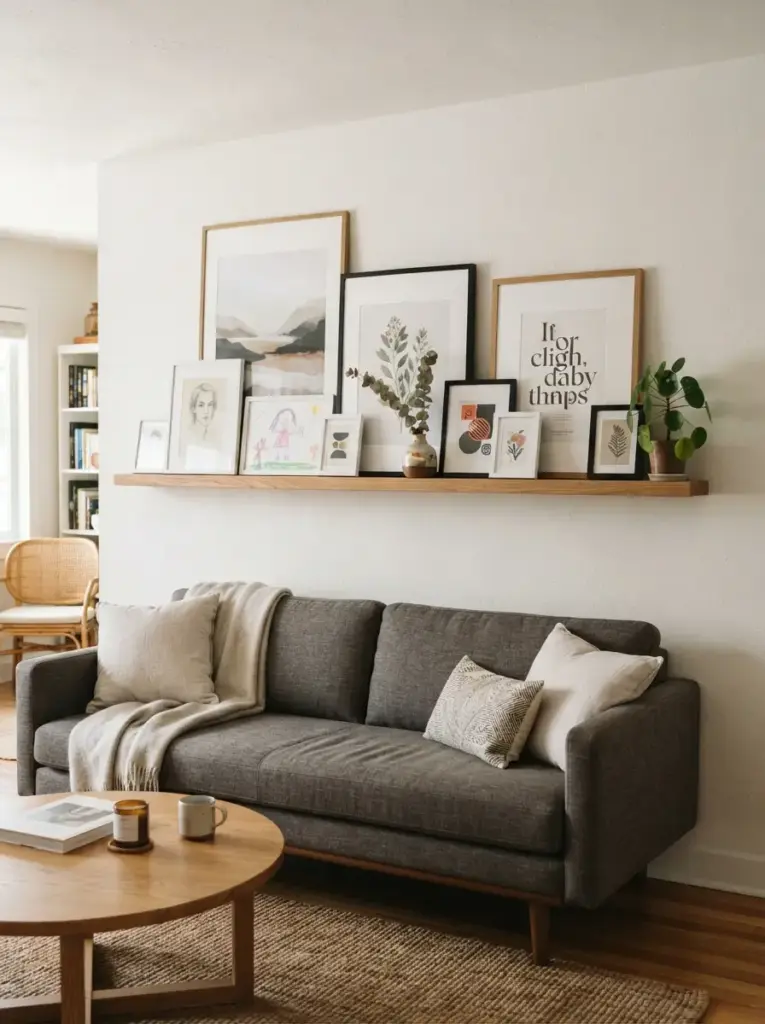
Picture ledges make it easy to layer framed prints without committing to a fixed arrangement. One long ledge above a sofa, desk, or dining bench allows several pieces to overlap slightly, creating depth while keeping the display flexible. Choose frames in two or three heights and place the tallest artwork toward the back. Smaller frames, a ceramic object, or a narrow plant can sit in front, provided the ledge does not become crowded.
Layering works well because it adds dimension to the wall and lets renters refresh the display seasonally. Warm oak ledges soften white walls, while black ledges connect with dark lighting fixtures or media furniture. Keep the total ledge width close to the furniture width below it, and mount it securely according to the wall type. This solution suits people who regularly change prints, families displaying children’s artwork, and beginners who feel nervous about measuring a complicated gallery wall.
Use Matching Prints in a Simple Grid
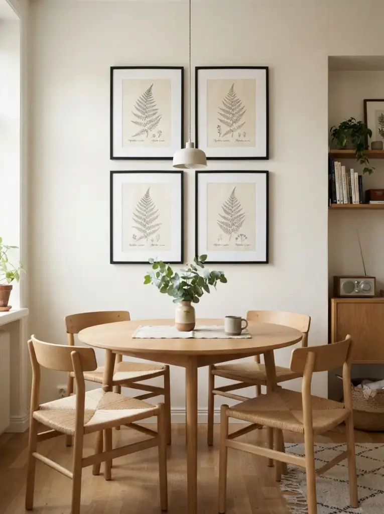
Matching print sets create order in small apartments, especially when furniture and accessories already include several colors. Choose four, six, or nine pieces with consistent borders, frame sizes, and visual themes. Botanical drawings, architectural sketches, monochrome photography, or geometric forms all work well. A grid looks strongest when every frame is level, and the gaps remain identical, so use a tape measure, painter’s tape, and a small spirit level during installation.
Grids improve a room because repetition makes the wall feel calm and deliberate. Black frames against warm white paint create crisp contrast, while pale oak frames blend gently with Scandinavian-style furniture. In a dining nook, four 12-by-16-inch prints can fill the wall without overwhelming the table. Students, first-time renters, and anyone furnishing a compact room often benefit from this method because printable art sets are affordable and easy to replace when tastes change.
Add Removable Wall Decals Around Framed Art
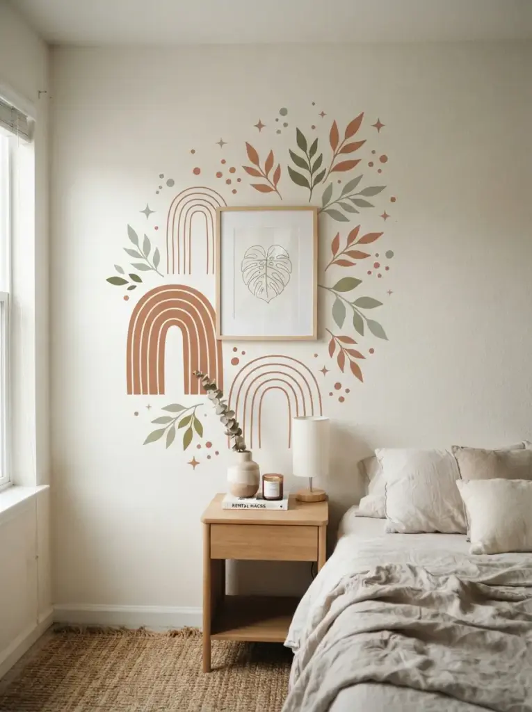
Removable decals can extend a small framed piece into a larger composition without requiring paint or wallpaper. Place simple leaves, arches, dots, stars, or curved lines around one central print, keeping enough open wall space so the design can breathe. Matte decals usually look more convincing than glossy vinyl because they reflect less light and sit more naturally against painted walls.
Decals are effective because they change the scale of the display at a low cost. A small botanical print can feel substantial when surrounded by muted green leaf shapes, while terracotta arches can give a plain bedroom wall more structure. Test one decal in a hidden area before covering a large section, since paint condition and wall texture affect removal. This idea is best for renters, children’s rooms, home offices, and anyone who wants a bold feature without creating a permanent Apartment Accent Wall.
Display Black-and-White Photography
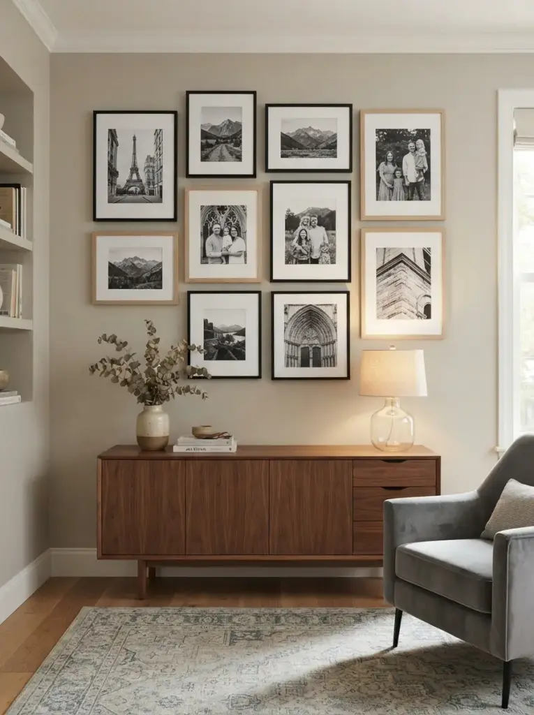
Black-and-white photography adds contrast without introducing another strong color palette. City streets, landscapes, family photographs, architectural details, and close-up textures all work well when printed consistently. Use white mats to create breathing room around each image, then choose black frames for definition or pale wood frames for a softer result.
Monochrome images improve visual balance because they connect easily with most furniture finishes. A set of three vertical photographs can make a narrow hallway feel taller, while one wide landscape works above a low sideboard. Warm 2700K lighting keeps the display inviting, whereas very cool bulbs may make white mats look harsh. This option suits minimalists, travelers, photographers, and people who want personal imagery that does not clash with patterned rugs or colorful upholstery.
Hang a Large Woven Wall Piece
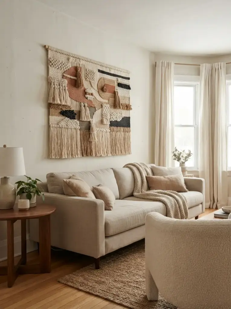
Woven hangings bring warmth to rooms dominated by straight lines and smooth finishes. Macramé, flat-weave rugs, handmade fiber panels, and lightweight tapestries can fill a broad wall without the weight of glass and heavy frames. Choose a design with a clear shape and limited colors, since overly detailed fabric may look busy in a compact room.
Fiber art helps because texture creates interest even when the palette stays neutral. Cream, sand, tobacco brown, muted black, and soft clay tones pair well with wood furniture, linen curtains, and boucle chairs. Hang the piece so it does not touch the sofa or bed, and leave at least 6 inches of clear space above the furniture. Renters and people living in older buildings often appreciate this solution because a large textile can also visually soften uneven walls or minor surface flaws.
Style the Wall Around the Television
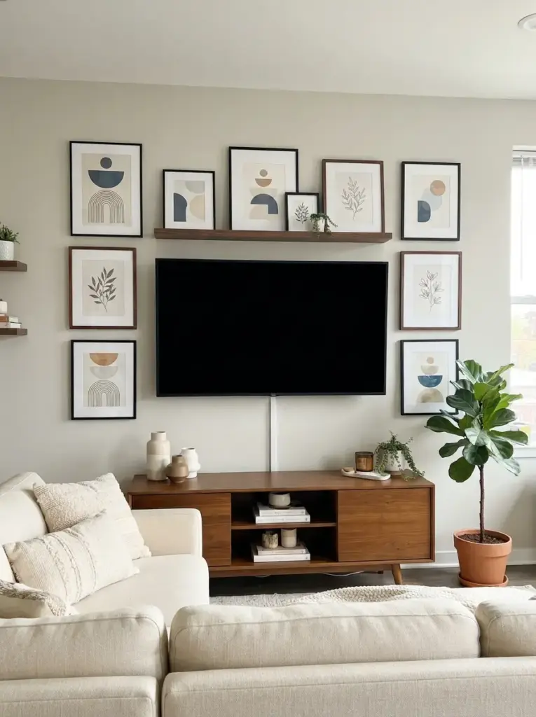
Televisions often create a large dark rectangle that feels disconnected from the rest of the room. Framed prints placed around the screen can make the media area feel intentional rather than purely functional. Choose artwork with medium contrast so it remains visible without competing with moving images. Keep frames at least 4 to 6 inches away from the television edges to prevent the arrangement from looking cramped.
Coordinated styling around an Apartment TV Wall works because art distributes visual weight beyond the screen. Black frames can echo the television border, while warm wood frames can connect the display to a media console. Avoid placing reflective glass directly opposite windows, since glare can affect both the artwork and the screen. This solution is best for small living rooms where the television wall is also the main focal wall and needs to look attractive when the screen is off.
Use Mirrors as Part of the Art Arrangement
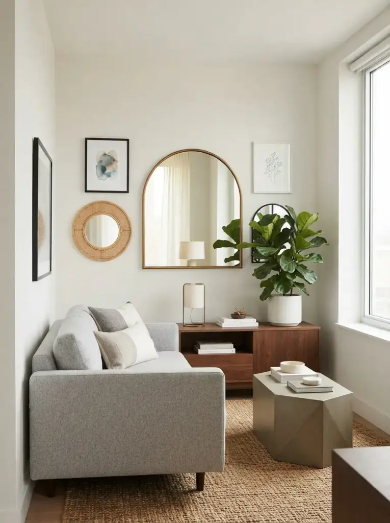
Mirrors can function like artwork when their shapes and frames contribute to the composition. Pair one rounded mirror with two small prints, or place several compact mirrors among framed images in a gallery wall. Curved forms soften boxy furniture and create contrast against rectangular doors, windows, and shelving.
Reflective surfaces help small rooms because they bounce light and reveal more of the space. Position mirrors where they reflect a lamp, window, plant, or attractive part of the room rather than a cluttered counter. Brass frames add warmth, black frames feel modern, and frameless mirrors suit very minimal interiors. People with dark apartments or narrow entryways gain the most from this idea, but careful placement matters because too many mirrors can make a wall feel restless.
Create a Rotating Seasonal Print Display
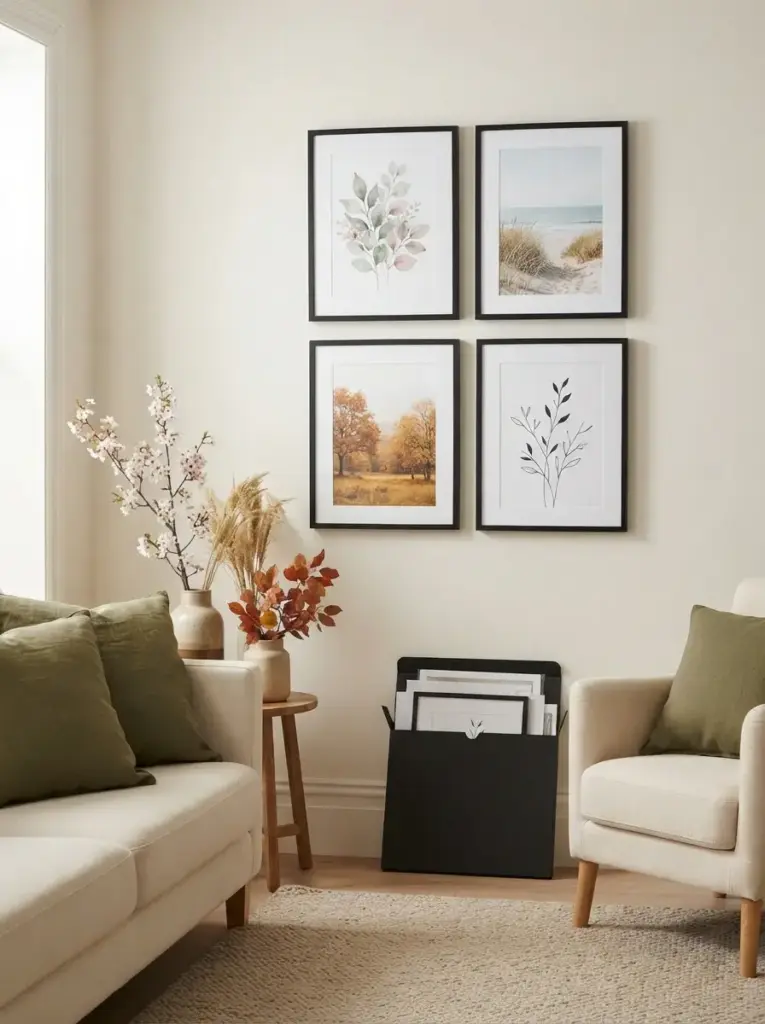
Seasonal decorating does not need to involve storing large wreaths, signs, or bulky objects. Keep several affordable prints in the same frame sizes and change them throughout the year. Muted florals work in spring, coastal photography suits summer, warm landscapes fit autumn, and simple line art can keep winter decor calm. Store unused prints flat inside a portfolio or behind the current artwork.
Rotation keeps the room fresh because the wall changes without requiring new furniture. Consistent frames prevent each update from feeling like a full redesign, while repeated room colors maintain continuity. Someone with olive cushions, for example, might choose spring botanicals, summer fields, autumn leaves, and winter branches that all include similar green tones. This approach works well for people who enjoy variety but have limited storage and a modest decorating budget.
Highlight Art With Warm Picture Lighting
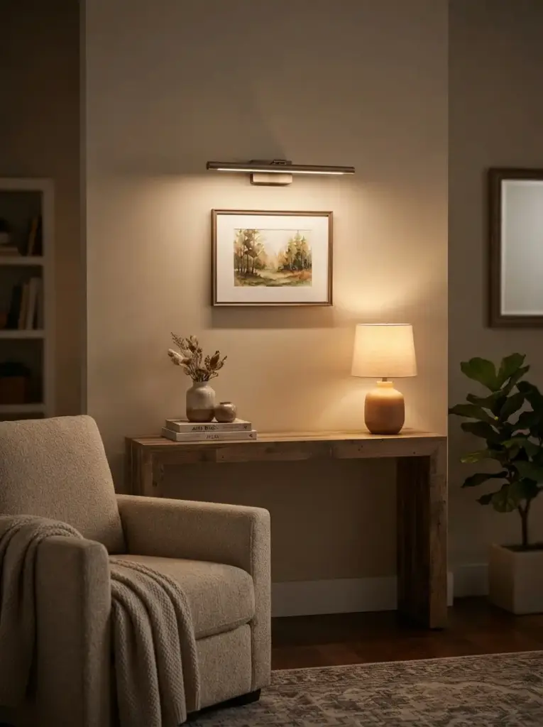
Good lighting can make inexpensive art appear more considered. Battery-operated picture lights, plug-in sconces, or adjustable track heads can focus attention on a favorite piece without major electrical work. Select warm white bulbs between 2700K and 3000K for living rooms and bedrooms because they flatter wood, skin tones, and warm-colored artwork. Neutral 3000K to 3500K light may suit home offices with cleaner white finishes.
Focused illumination works because it increases contrast between the artwork and the surrounding wall. Position the light so it spreads across the piece rather than creating one bright spot. Battery fixtures are practical for renters, but check their depth and finish so they do not look bulky above small frames. Art lovers, evening entertainers, and people with limited natural light will gain the most from this upgrade, especially when the main ceiling fixture leaves walls in shadow.
Turn Personal Photos Into a Refined Display
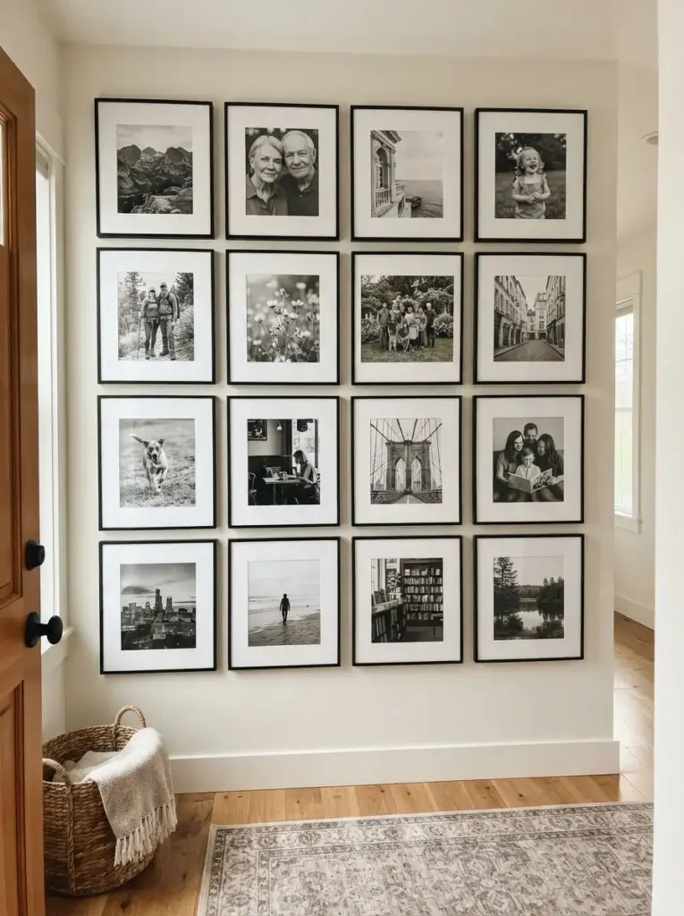
Personal photographs feel more polished when they follow a consistent editing and printing style. Choose images with similar lighting, convert them all to black and white, or apply one restrained color treatment before printing. Avoid filling every frame with close-up faces; include landscapes, architecture, objects, and wider family scenes to create visual variety.
Meaningful displays succeed because they add character without relying on generic decor. White mats and identical frames make phone photos look more intentional, while high-quality matte prints reduce glare. A hallway can hold a chronological sequence, and a bedroom can feature travel photographs in a quiet two-by-two grid. Families, couples, travelers, and pet owners often prefer this idea because the wall tells a story that cannot be copied from a store.
Lean Large Art Instead of Hanging It
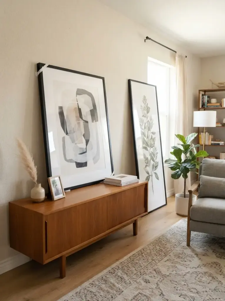
Leaning artwork offers flexibility when drilling is restricted or when wall surfaces are difficult. Place a large framed piece on a low console, wide dresser, or sturdy floor area, then secure it with discreet anti-tip measures. Smaller objects can sit in front, but keep the composition simple so the artwork remains the focus. Floor-leaning pieces should not block walkways, outlets, vents, or doors.
Casual placement works because it introduces height while making the room feel less formal. A large abstract print behind a low sideboard can visually connect furniture to the wall, and a full-height piece can fill an awkward corner. Renters should use lightweight frames with acrylic glazing and add removable grip pads to prevent slipping. This method is especially useful for people who move often or like to rearrange rooms without repairing multiple holes.
Paint or Frame Your Own Simple Art
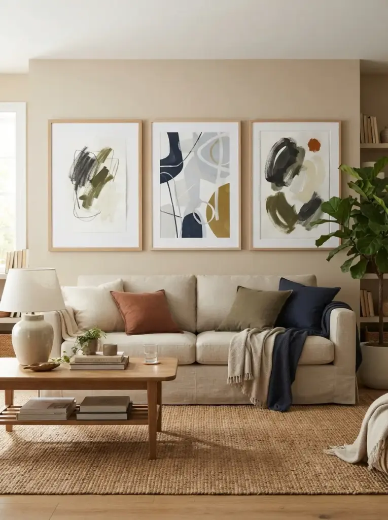
Original art does not require advanced drawing skills. Large sheets of quality paper can hold simple brush marks, color blocks, curved lines, or repeated shapes. Choose three colors from the room and one contrasting shade, then test the combination on scrap paper before creating the final piece. Framing the result with a generous white mat gives even simple marks more structure.
Handmade art feels convincing because it responds directly to the room’s palette and proportions. A beige living room might use charcoal, olive, cream, and a small amount of rust, while a blue bedroom could combine navy, pale gray, white, and muted mustard. Keep the design simple enough to view from across the room, and avoid copying complicated artwork that exceeds your skill level. Creative beginners, families, and budget-conscious decorators can use this method to fill large walls with personal work at a manageable cost.
Choose Better Prints and Frames
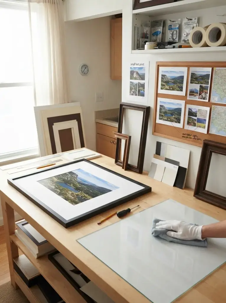
Print quality affects the result more than many beginners expect. Low-resolution files can look sharp on a phone yet appear blurry when enlarged, so check the recommended print dimensions before ordering. Matte paper suits most apartments because it reduces reflections from windows and lamps, while satin paper can add slightly richer color without the strong glare of a glossy finish. Fine details need a clean, high-resolution source, particularly for photography, maps, and typography. Before paying for a large print, order a small test or print a cropped section at full scale. That simple check reveals weak detail, unexpected color shifts, and paper that feels too thin. Acrylic glazing is lighter and safer than glass in busy homes, although it scratches more easily and should be cleaned with a soft cloth.
Frame proportions should support the artwork rather than overpower it. Narrow frames suit modern graphics and photography, while wider wood profiles can give small prints more presence. Mats create visual space around detailed images and help standard frames hold less common print sizes. White and warm ivory mats remain versatile, but bright white can look stark beside cream walls or warm lighting. Deep mats create a more gallery-like appearance, especially when the visible border measures 2 to 4 inches. Check frame corners, backing clips, hanging hardware, and glazing before purchase, since weak construction often causes more frustration than an inexpensive print. In humid rooms, avoid placing valuable paper art near cooking steam, bathroom moisture, or poorly insulated windows where condensation may collect.
Common Wall Art Mistakes to Avoid
Poor scale causes more problems than almost any other decorating mistake. Small frames floating above a large sofa usually look disconnected, while oversized pieces squeezed onto narrow walls feel uncomfortable. Measure the wall and furniture before buying anything, then use painter’s tape to mark the proposed size. Viewing the taped outline from the room entrance helps you judge proportion more accurately than holding a frame close to the wall.
Incorrect hanging height can also make a room feel awkward. People often place art too high, especially above sofas, beds, and consoles. The center of a standalone piece generally works near eye level, but furniture-based displays should relate to the item below them. Keeping the lower edge 6 to 10 inches above furniture usually creates a stronger visual link. Very high ceilings do not mean the artwork should move close to the ceiling; the display still needs to connect with the human scale.
Too many colors can weaken the room’s overall direction. Artwork does not need to match every cushion, yet repeating two or three existing colors creates harmony. Rooms with patterned rugs, colorful curtains, or busy upholstery often benefit from calmer prints. Neutral rooms can handle bolder art, but one dominant piece usually works better than several competing statements. Use the room’s largest permanent items as a guide rather than choosing artwork based only on a small accessory.
Weak mounting choices create both visual and safety problems. Removable strips must match the frame weight, wall texture, and manufacturer’s instructions. Heavy glass frames should not hang above beds or seating without secure hardware. Test painted surfaces before using adhesive, clean the wall properly, and allow paint to cure fully after repainting. Renters should photograph walls before installation and keep all packaging instructions in case careful removal becomes necessary later.
Budget-Friendly Wall Art Tips
Printable art offers one of the easiest ways to decorate a large wall at a low cost. Purchase or create digital files in sizes that fit standard frames, since custom framing can quickly exceed the cost of the print. Office supply stores often provide affordable matte printing for larger pieces. Choosing standard dimensions such as 8 by 10, 11 by 14, 16 by 20, and 18 by 24 inches also makes future replacements easier.
Secondhand frames can save money when their shapes are good, but the finishes look dated. Light sanding and a simple coat of paint can unify mismatched pieces. Black, warm white, and medium wood tones are flexible choices, but avoid painting valuable vintage frames before checking their condition. Replace damaged backing boards, clean glazing carefully, and use new hanging hardware when necessary. A coordinated frame finish can make inexpensive prints look far more deliberate.
Free materials often produce surprisingly useful decor. Calendar pages, maps, sheet music, fabric samples, pressed leaves, children’s drawings, postcards, and book illustrations can all become framed displays when used thoughtfully. Select pieces with a shared theme or palette so the wall feels curated rather than random. Large mats can help small items occupy more visual space, reducing the number of objects needed to fill the wall.
Gradual collecting prevents rushed purchases. Start with one strong piece, then add smaller items after living with the room for several weeks. Observing the wall at different times of day reveals glare, shadow, and color changes that may affect future choices. Waiting also gives you time to compare prices, find secondhand frames, and avoid buying filler art that you do not genuinely enjoy.
Apartment Wall Art Tips for Small Rooms
Apartment Wall Art should support the room’s layout rather than cover every empty surface. Leave some walls clear so the eye can rest, especially in studios where the living, dining, and sleeping zones share one view. Use larger pieces in main areas and smaller groupings in transitional spaces such as hallways or entry corners. Consistent frame finishes can visually connect separate zones without making them identical.
Vertical arrangements help when floor space is limited. Stacked prints, tall photographs, narrow fiber panels, and portrait-format canvases draw attention upward and make low ceilings feel less dominant. Horizontal art works better above long furniture such as sofas, beds, sideboards, and media consoles. Matching the artwork’s direction to the furniture below it creates a stable composition and reduces the chance of the wall feeling top-heavy.
Color temperature also affects how art appears. Warm bulbs between 2700K and 3000K bring out cream, rust, wood, and olive tones, while cooler bulbs emphasize blue and gray. Mixed bulb temperatures can make frames and mats look inconsistent, so use similar lighting in connected rooms. Natural light changes throughout the day, making it useful to test prints against the wall before final mounting.
Frequently Asked Questions
How high should wall art hang above a sofa?
Keep the bottom of the artwork around 6 to 10 inches above the sofa back. That distance allows the art and sofa to read as one arrangement instead of two unrelated objects. Very tall sofa backs may require slightly less space, while low-profile seating can handle a little more. Step back several feet before final mounting because close viewing can make gaps appear smaller than they really are.
What size artwork works best in a small apartment?
Medium and large pieces often work better than many tiny frames because they reduce visual clutter. Above the furniture, choose artwork that covers roughly two-thirds of the furniture’s width. Narrow walls can hold vertical pieces, while wide walls suit horizontal formats or grouped sets. Painter’s tape helps test dimensions before spending money or placing hooks.
Can renters hang art without damaging walls?
Removable strips, adhesive hooks, picture ledges, tension systems, and leaning frames can reduce permanent changes. Product instructions still matter because wall texture, paint age, humidity, and frame weight affect performance. Avoid using adhesive on fresh paint, wallpaper, or damaged surfaces without testing. Heavy pieces should use secure hardware if the lease allows it, particularly above beds and seating.
Should every frame in a room match?
Matching every frame is not necessary, but the collection needs a visual connection. Repeating one finish, one material, or one color usually creates enough unity. Black and wood frames can mix successfully when their proportions remain similar. Too many ornate, glossy, rustic, and modern styles on one wall may make the display feel accidental.
How can I coordinate art with an Apartment Accent Wall?
Let the wall color guide the artwork’s contrast. Dark green, navy, charcoal,
or terracotta walls often look strong with lighter mats and frames, while pale walls can support deeper artwork. Avoid selecting prints that disappear into the wall or repeat the exact paint color everywhere. One or two shared tones create a connection, but contrast keeps the display readable.
How many pieces of art should be in one room?
Room size, furniture placement, and visual complexity matter more than a fixed number. One oversized piece may be enough in a compact living room, while a hallway can handle several smaller frames. Stop adding art when each major furniture zone has a clear visual anchor,
and the room still includes some open wall space. Balanced blank areas prevent the display from becoming tiring.
Conclusion
Thoughtful wall decor can change how an apartment feels without changing its floor plan. Strong results come from choosing the right scale, connecting artwork to furniture,
repeating a controlled color palette, and leaving enough open space around each display. Renters can rely on removable mounting systems, lightweight materials, ledges, and leaning frames to create impact without unnecessary damage. Careful preparation also makes future rearranging easier when furniture, lighting, or personal tastes change.
Start with the wall that affects the room most, then choose one idea that fits your budget and confidence level. Apartment Wall Art becomes easier to manage when you measure first,
test layouts with paper or tape, and build the display gradually. A well-planned arrangement will make the room feel more personal, balanced, and visually complete.