
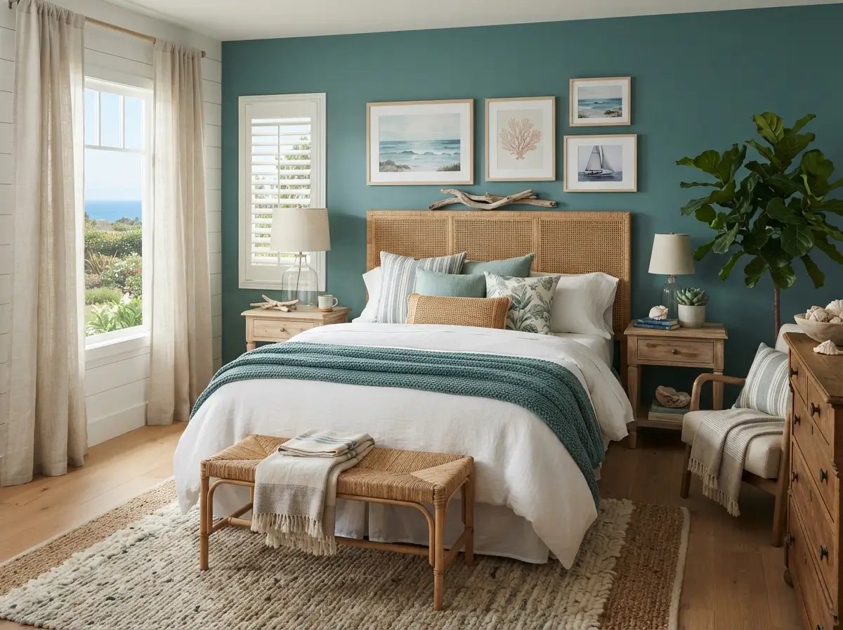

Coastal bedrooms feel restful when color, light, texture, and furniture work together instead of competing for attention. Teal brings enough depth to make a room feel designed, yet it still connects naturally with sea glass, painted boats, shaded water, and weathered coastal homes. Used carefully, the color can make a plain bedroom feel calmer without turning it into a themed beach set. The most successful rooms balance teal with warm whites, sandy neutrals, natural wood, soft fabrics, and practical storage. Small spaces need even more restraint, because too many dark surfaces can reduce visual breathing room and make everyday clutter more noticeable.
Beginners often assume every wall, curtain, cushion, and accessory must match. Better results come from choosing one main teal element, two supporting colors, and several quiet textures. A Teal Bedroom can feel bright, grown-up, cozy, or modern depending on the undertone you select. Blue-based teal looks crisp beside white and pale oak, while green-based teal feels richer beside cream, cane, and warm walnut. The following ideas explain where to use color, why each choice helps, who it suits, and how to avoid expensive decorating mistakes.
Can Teal Create a Calm Coastal Bedroom?
Yes. Teal can create a calm coastal bedroom when it appears in controlled amounts and is balanced by lighter surfaces. Choose one dominant placement, such as a painted wall, upholstered headboard, duvet, or pair of curtains. Repeat the shade in only two or three smaller details so the room feels connected rather than heavily coordinated. Warm white walls, woven materials, pale timber, and soft beige flooring keep the darker color from closing in. Lighting also matters. Bulbs around 2700K to 3000K make teal feel comfortable at night, while strong cool-white bulbs can make the same paint look sharp or slightly green.
Paint One Teal Wall Behind the Bed
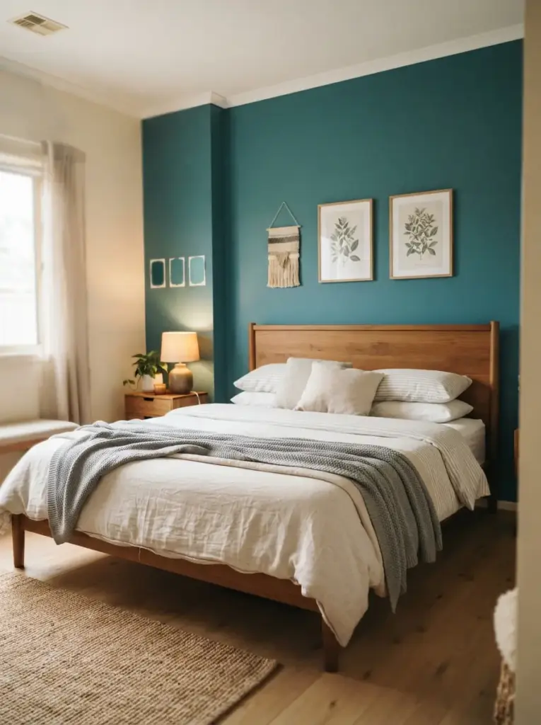
Placing teal behind the headboard gives the bed a clear visual anchor and keeps the strongest color away from your direct view while resting. The wall acts like a large backdrop, so even a basic timber or fabric bed frame looks more intentional. Medium-depth shades work well in rooms with average daylight. Very dark petrol teal suits bright south-facing bedrooms, while muted blue-green paint is safer in small or shaded rooms. Keep the remaining walls warm white, soft ivory, or pale oyster rather than brilliant white, which can create a hard contrast.
Renters can recreate the effect with removable wallpaper, peel-and-stick panels, or a large painted plywood board secured behind the bed. People who own a simple bed without a headboard benefit most because the color creates structure without another furniture purchase. Test the shade on at least two sections of wall and observe it during morning, afternoon, and evening light. Paint samples placed only beside the window can mislead you, since the wall behind the bed may receive far less natural light.
Choose a Soft Teal Upholstered Headboard
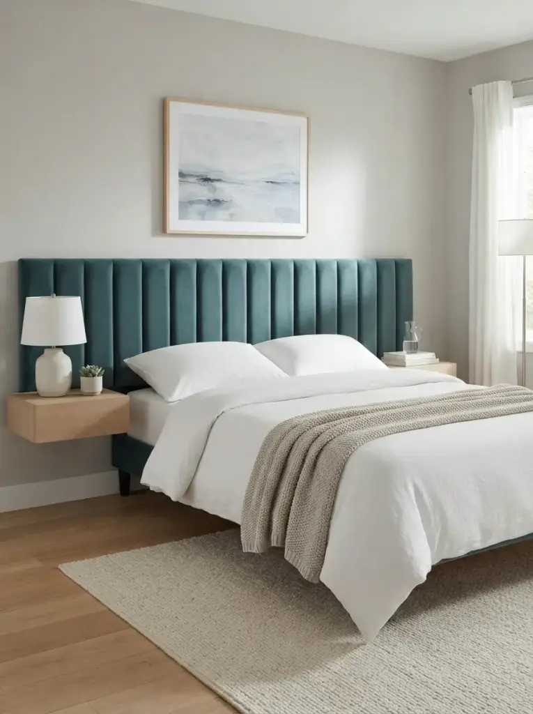
Upholstery introduces teal at eye level without committing the whole room to paint. Linen-look fabric, brushed cotton, or low-pile velvet adds softness and absorbs light, which makes strong colors feel quieter. A wide headboard that extends slightly beyond the mattress can make a narrow bed appear more generous. Channel-tufted or gently curved styles work well for modern coastal rooms, while plain rectangular shapes suit minimal interiors. Pair the headboard with white, oatmeal, or light gray bedding so the fabric remains the main feature.
Small-space decorators should choose a wall-mounted model rather than a deep freestanding frame. Wall-mounted panels save several inches and make cleaning easier. Budget shoppers can cover a basic headboard with upholstery fabric and batting, provided the surface is smooth, and the staples remain hidden. The approach is best for anyone who wants color near the bed but prefers neutral walls. Avoid combining a busy headboard shape with patterned wallpaper, heavily printed bedding, and multiple decorative cushions, because the sleeping area will quickly feel crowded.
Layer White Bedding with Teal Accents
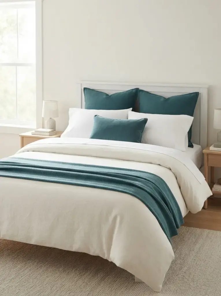
White bedding creates visual space and gives teal a clean background. Start with white or warm ivory sheets, then add a teal quilt, folded coverlet, or two large pillow covers. Varying the materials prevents the palette from feeling flat. Crisp cotton sheets, a washed linen duvet, a knitted throw, and one smooth velvet cushion can all share similar colors while still creating depth. Keep the strongest shade near the lower third of the bed if you want the room to feel lighter from the doorway.
Busy households benefit from a washable teal throw rather than a full colored duvet, because marks are easier to manage and seasonal changes cost less. Pet owners may prefer a mid-tone woven blanket that hides loose hair better than very dark velvet. Use no more than three decorative pillow layers on a standard double bed. Excess cushions consume storage space at night and make a small room harder to maintain. Simple styling looks calmer because the bed reads as one broad shape rather than a pile of separate items.
Combine Teal with Sandy Beige and Cream
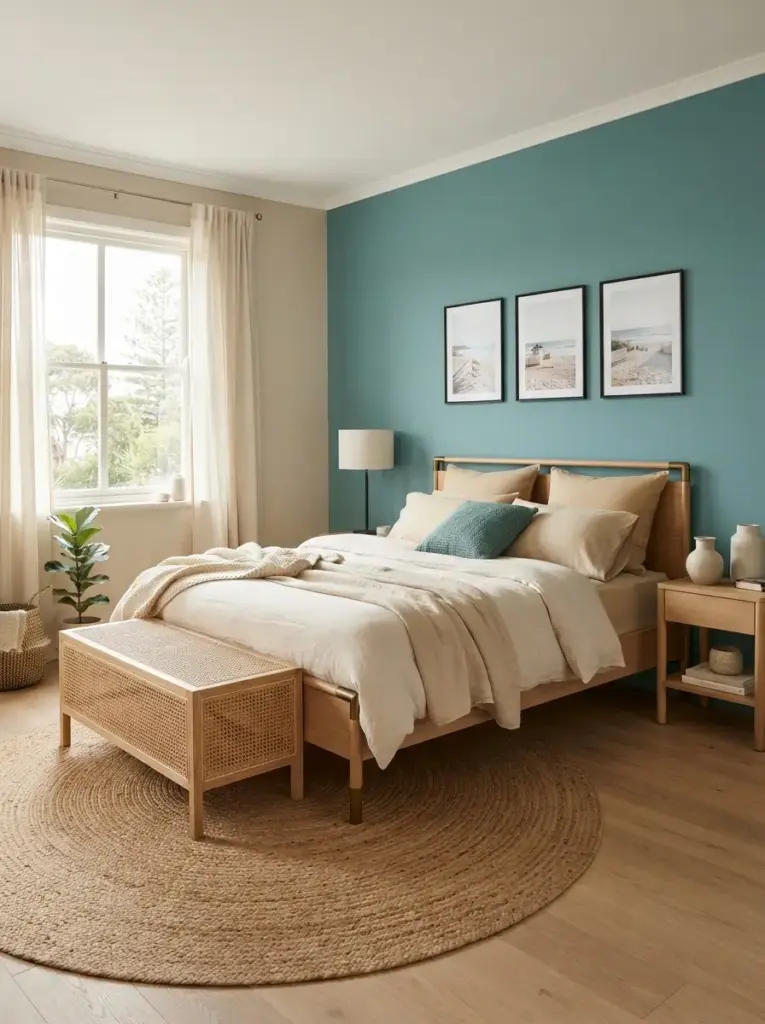
Sandy neutrals reduce the coolness of teal and create the relaxed contrast associated with coastlines. Look for beige with a warm undertone instead of gray-beige, especially in north-facing rooms. Cream curtains, a jute-style rug, light tan cushions, and natural linen bedding can support teal without copying the same color everywhere. Pale mushroom also works as a bridge between warm wood and blue-green paint. The combination suits bedrooms that need comfort but still feel fresh in daylight.
People nervous about bold color can follow a simple ratio: roughly 60 percent light neutral, 30 percent teal, and 10 percent darker or warmer accents. Exact measuring is unnecessary, but the guide prevents teal from overwhelming every surface. Add black only in slim details such as a lamp stem or picture frame. Large black furniture can make the palette feel heavier than intended. For a softer result, choose aged brass, light oak, or woven cane as the supporting finish.
Add Light Oak or Weathered Wood Furniture
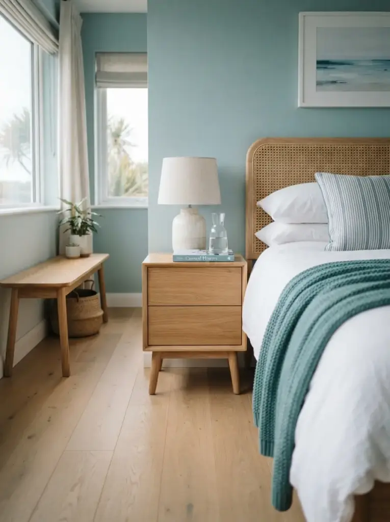
Wood stops coastal color schemes from feeling cold or overly polished. Light oak, ash, bamboo, and gently weathered pine all sit comfortably beside teal because their warm grain balances blue-green undertones. A simple oak bedside table, narrow bench, or chest of drawers can be enough. Matching every furniture piece is not necessary. Repeating a similar wood temperature looks more natural than buying an identical suite, and mixed pieces often fit a compact layout better.
Bedrooms with limited floor space should use raised furniture on visible legs. More floor showing beneath the pieces creates a sense of openness and improves access for cleaning. Choose bedside tables around the same height as the top of the mattress, so lamps, books, and water are easy to reach. Avoid distressed furniture with heavy fake wear, rope handles, or painted slogans. Those details can push a calm scheme toward a literal beach theme. Clean lines and real wood texture provide a more lasting coastal reference.
Use Teal Curtains as a Framing Device
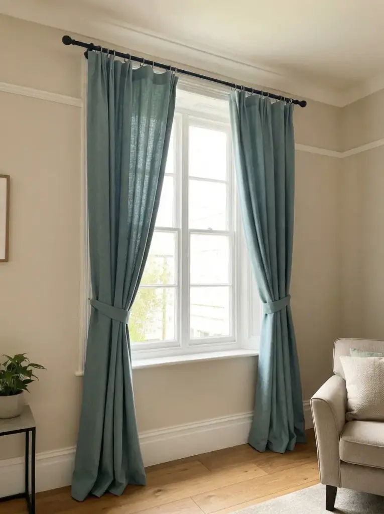
Curtains can frame a window and add substantial color without changing the walls. Choose full-length panels and hang the rod several inches above the frame to make the ceiling appear higher. Extending the rod beyond each side lets more glass remain uncovered when the curtains are open. Medium-weight linen blends provide movement and privacy, while lined cotton or velvet helps with light control and insulation. In small rooms, select a slightly muted shade rather than an almost-black teal.
Shift workers and light sleepers need blackout lining, but the lining should remain hidden from the room side. Rental homes can use tension rods for light fabrics, though secure brackets are safer for heavy panels. Measure from the planned rod position to the floor instead of measuring only the window. Curtains that stop awkwardly above the skirting board can shorten the wall visually. Let the fabric skim the floor or finish about one centimeter above it for easy cleaning and a tidy appearance.
Bring in Sea Glass Green and Pale Aqua
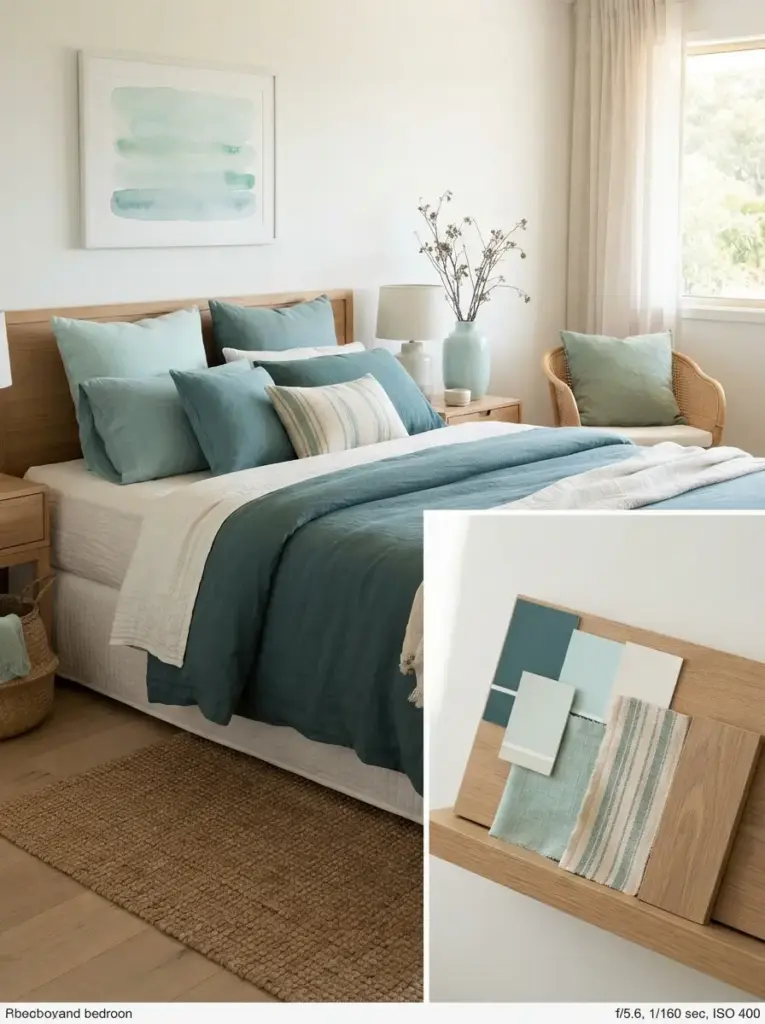
Nearby blue-green shades help teal feel layered rather than isolated. Sea glass green, soft aqua, and dusty turquoise can appear in small objects, artwork, or one striped textile. Keep their saturation lower than the main teal so they support rather than compete. A pale aqua vase, faded green cushion, and watercolor print can connect the room without turning it into a rainbow. Warm white and sand-colored surfaces should still occupy most of the space.
Color-sensitive decorators benefit from gathering samples on a single board before buying. Place paint chips, fabric pieces, wood samples, and flooring photographs together under the room’s actual lighting. Similar colors can clash when one leans strongly yellow, and another leans strongly blue. Limiting the palette to one deep blue-green, one pale water tone, and one warm neutral keeps decisions manageable. Teal Bedroom Ideas often work best when the supporting shades look sun-faded rather than bright and tropical.
Install Warm Layered Lighting
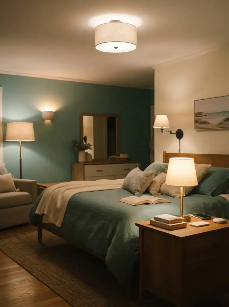
Color changes dramatically after sunset, so lighting deserves the same attention as paint. Use a ceiling fixture for general visibility, bedside lamps for reading, and one soft accent source such as a wall light or shaded floor lamp. Bulbs between 2700K and 3000K usually flatter teal, cream, and timber. A dimmer gives greater control, especially in bedrooms used for dressing, working, and relaxing. Choose bulbs with a color rendering index of 90 or above when accurate clothing and paint colors matter.
Bedside lights should direct illumination toward books without shining directly into your eyes. Wall-mounted swing-arm lamps free the nightstand surface and suit narrow rooms. Renters can use plug-in sconces with covered cords or rechargeable lamps. Avoid blue-white bulbs around 5000K, because they can make a calm palette feel clinical. Matching every lamp is unnecessary; coordinating the finish and shade color is enough. Good lighting supports the coastal feeling through warmth and softness, not through shell-shaped fixtures.
Place a Natural Fiber Rug Under the Bed
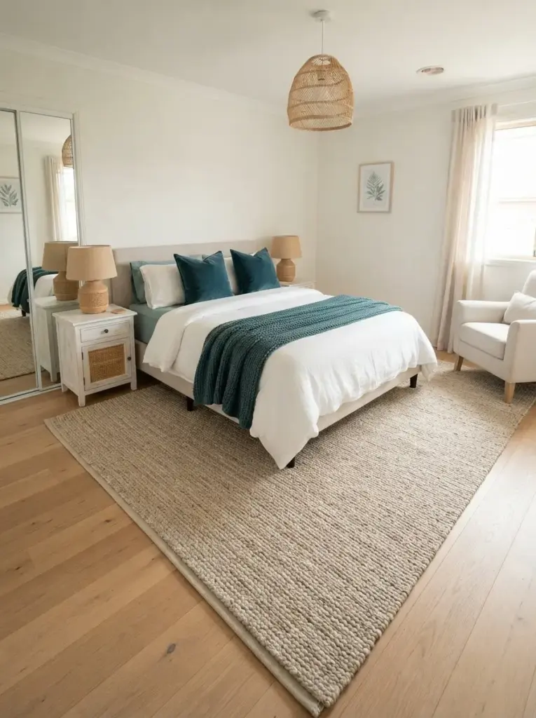
Rugs add warmth, absorb sound, and connect the bed to the surrounding furniture. Jute, sisal-look weaves, wool-jute blends, and flatwoven cotton all provide a subtle coastal texture. For a double or queen bed, choose a size large enough to extend beyond both sides and the foot. A small rug floating only at the end of the bed often looks disconnected. Low-pile options are easier near wardrobe doors and in rooms where chairs need to move.
Bare-floor bedrooms gain the most from this idea, although a flat rug can also sit over low-pile carpet. Sensitive feet may find pure jute rough, so consider a softer woven blend or place a small washable runner beside the bed. Rug pads prevent slipping and reduce movement during vacuuming. Select natural tan, oatmeal, or a quiet stripe rather than a high-contrast nautical pattern. Texture gives the room character while allowing teal to remain the clear color statement.
Style Coastal Artwork Without Using Clichés
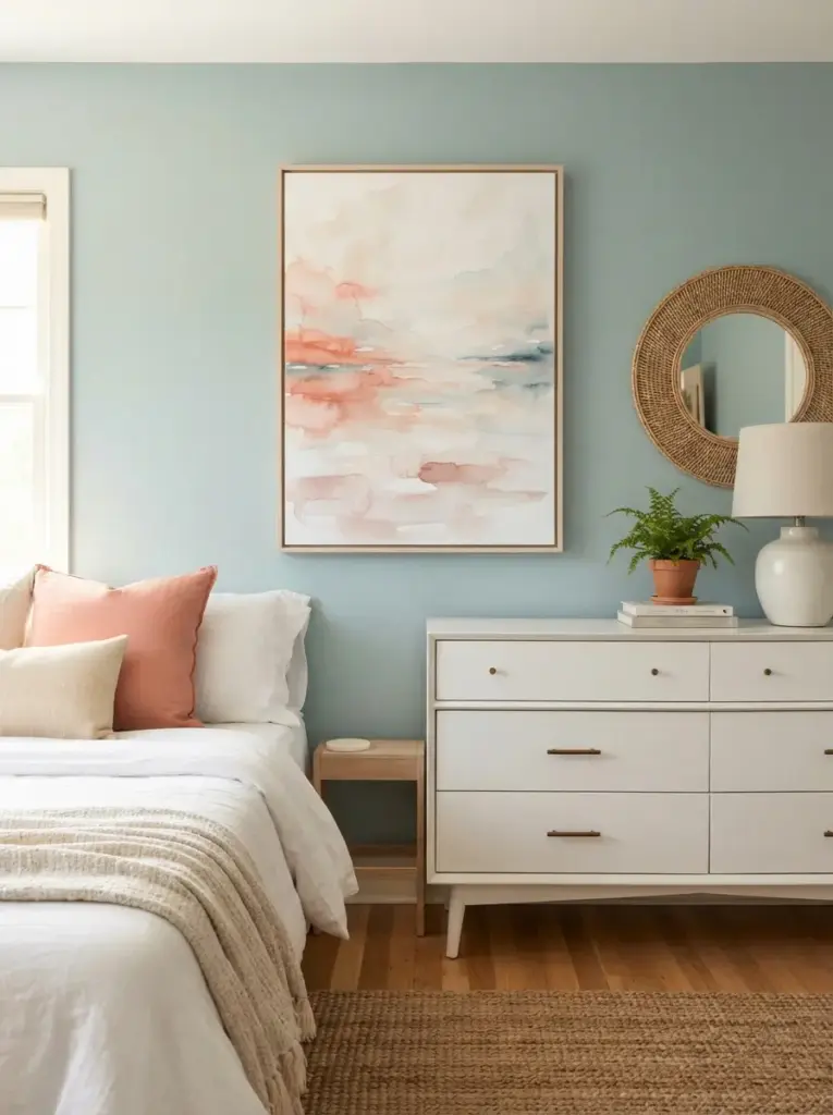
Artwork can suggest water, air, and open horizons without relying on anchors, boats, or printed beach quotes. Abstract washes, misty landscapes, botanical studies, and simple line drawings fit the theme more subtly. Choose one large piece above the bed or dresser instead of several tiny frames scattered around the room. Larger art creates a calmer focal point and reduces visual fragmentation. Pull one or two colors from the room, but do not search for an exact teal match.
Renters can lean framed prints on a dresser or use removable hanging strips within the manufacturer’s weight limit. People decorating narrow rooms should use vertical art to draw the eye upward. Keep frames simple in pale wood, white, aged brass, or slim black. Avoid hanging heavy artwork directly over a bed unless the fixings and wall type can support it safely. Coral Bedroom Ideas can also provide useful inspiration here, because muted coral artwork creates a warm counterpoint to blue-green walls without dominating the coastal palette.
Introduce Woven Cane and Rattan Details
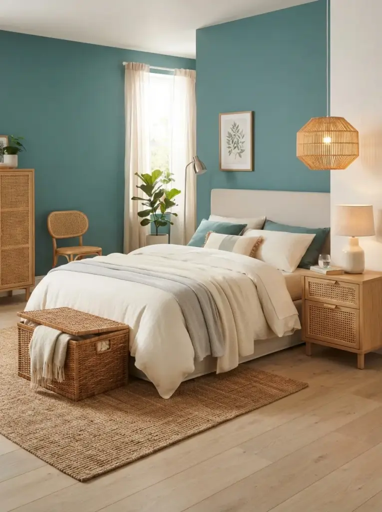
Cane and rattan bring lightness because their open patterns allow air and wall color to remain visible. A cane-front bedside table, woven pendant shade, small chair, or basket can soften painted surfaces and square furniture. One or two woven elements are usually enough. Too many baskets and rattan pieces can make the room feel like a display area rather than a place for rest. Choose smooth, well-finished pieces that will not catch delicate fabrics.
Compact bedrooms benefit from dual-purpose woven storage. A lidded basket can hold spare blankets, while a narrow cane-front cabinet hides toiletries or paperwork. People who prefer a cleaner, modern style should use rattan in simple silhouettes rather than highly curved vintage pieces. Keep woven items away from damp walls and direct radiator heat, which may cause warping or brittleness. The natural honey tone works especially well with medium teal, ivory bedding, and pale timber flooring.
Add One Warm Coral or Terracotta Accent
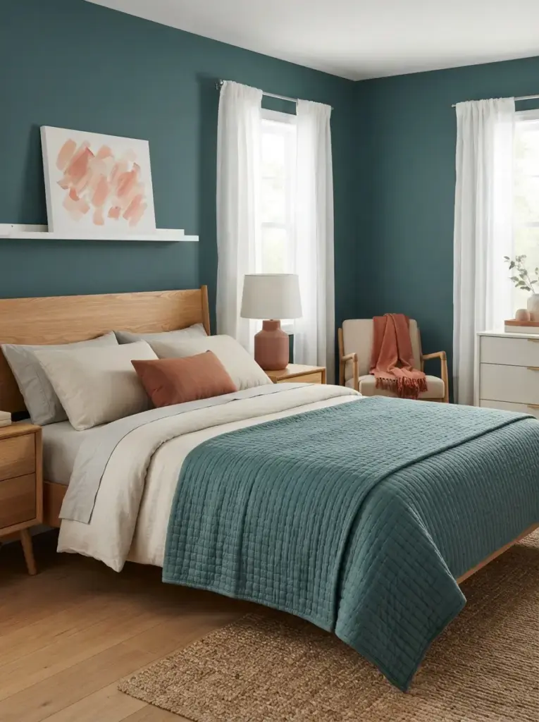
Small warm accents prevent teal from feeling too cool and create a balanced color relationship. Coral, terracotta, and muted peach sit opposite blue-green tones, so even a modest amount becomes noticeable. Use one cushion, a ceramic lamp base, a small throw, or artwork with warm brushstrokes. Dusty shades are easier to live with than neon coral. Repeat the accent once across the room so it feels deliberate, but avoid spreading it across every shelf.
People who enjoy seasonal updates can switch these accents without repainting. Terracotta works especially well in autumn, while faded coral feels lighter in spring and summer. Warm Burnt Orange Bedroom Ideas offer useful examples of pairing earthy textiles with natural wood, but scale the orange back to about five or ten percent here. Too much warm color will compete with teal and weaken the coastal calm. Muted contrast creates energy while preserving a restful overall impression.
Create a Teal Reading Corner
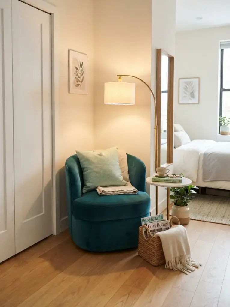
Unused corners can become functional with a compact chair, slim floor lamp, and small side table. Choose a chair in teal if the walls remain neutral, or select cream, tan, or light gray when the room already has a strong painted feature wall. Armless chairs and rounded slipper chairs occupy less visual space than bulky lounge models. Leave enough clearance for wardrobe doors and walking routes. A corner that blocks movement will become frustrating, regardless of how attractive it looks.
Readers need focused light positioned slightly behind and beside the shoulder. A lamp around 2700K creates warmth, while a bulb near 3000K offers clearer task lighting. Add a small basket for magazines or a folded blanket rather than placing a large shelf in the corner. Studio apartments and guest bedrooms benefit most because the chair creates a second purpose without major construction. Fresh Mint Bedroom Ideas can inspire lighter supporting textiles, especially when teal upholstery needs a soft green companion.
Use Mirrors to Reflect Daylight
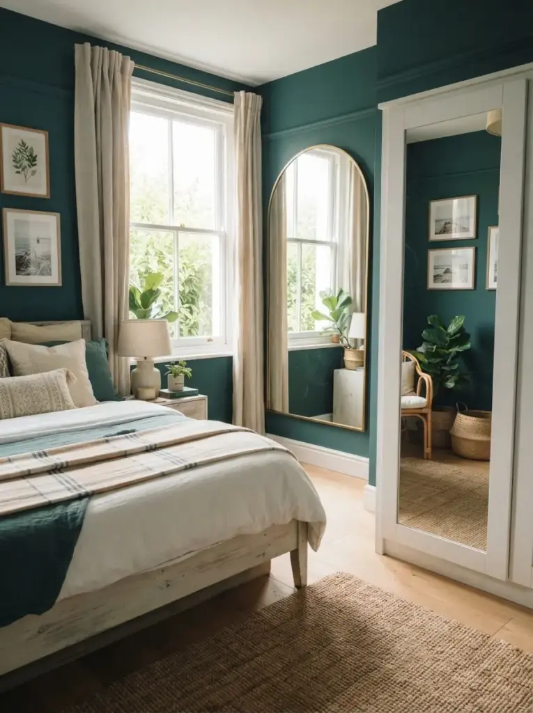
Mirrors help distribute natural light and can make a narrow bedroom feel broader. Position one opposite or at an angle to the window, but check what it reflects before fixing it. A mirror that doubles the view of clutter or an open wardrobe will make the room feel busier. Rounded, arched, and softly rectangular shapes complement the curves often used in coastal interiors. Pale timber, thin brass, and simple white frames all work beside teal.
Small-room owners should consider a full-length mirror on a wardrobe door or a tall leaning mirror secured safely to the wall. Renters can use over-door models or adhesive mirror tiles designed for removable installation, though seams may create a more casual result. Avoid placing a large mirror directly where the morning sun can cause glare from the bed. The goal is gentle light movement, not a bright reflection aimed at your face. Clean mirrors regularly because marks become highly visible beside deep-colored walls.
Keep Storage Closed and Surfaces Simple
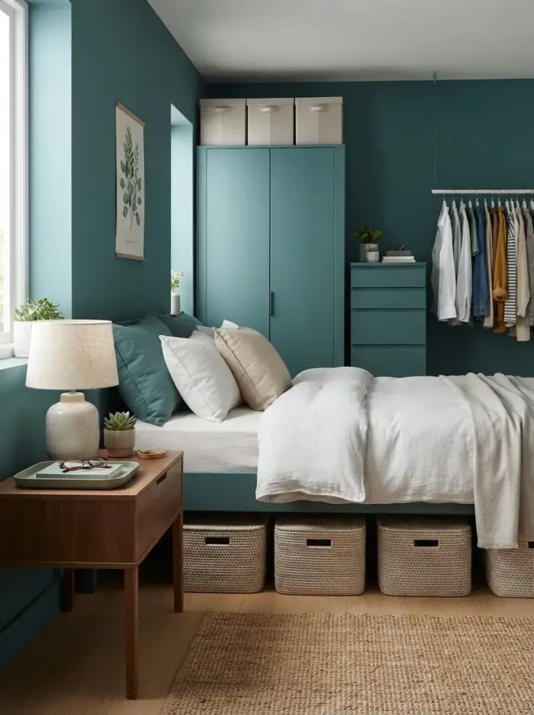
Calm bedrooms depend as much on storage as on color. Teal draws attention, so clutter nearby becomes more obvious. Use drawers, lidded baskets, under-bed boxes, and closed wardrobe sections for everyday items. Reserve open surfaces for a lamp, one useful tray, a book, and perhaps a small plant or vase. Furniture with integrated storage is especially valuable in rooms under about 120 square feet, where every extra object affects movement.
Anyone managing a small wardrobe should group clothing by use rather than color. Keep daily items at easy reach, seasonal pieces higher up, and rarely used belongings under the bed. Clear boxes are practical inside cupboards, while opaque containers look calmer on display. Avoid filling the top of a tall wardrobe with mismatched bags and cartons. Matching fabric boxes or one long storage basket creates a cleaner line. A well-organized Teal Bedroom feels more spacious because the eye can rest on broad areas of color and texture.
Common Mistakes to Avoid
Using Too Much Dark Teal
Covering every wall, curtain, bed layer, and furniture surface in dark teal can make the room feel enclosed. Rich shades absorb light, particularly in bedrooms with small windows or deep floor plans. Keep at least half the visible surfaces light unless the room receives strong daylight and you deliberately want a cocooning result. Paint ceilings and woodwork in warm white to preserve clear edges. Large color samples reveal whether the shade remains attractive on dull days, not only under bright showroom lighting.
Matching Every Teal Item Exactly
Exact matching often makes a bedroom feel assembled from a catalog rather than gradually collected. Fabric, paint, ceramic, and printed ink also reflect light differently, so identical-looking samples may still vary in the finished room. Choose related tones instead. One deep teal, one faded blue-green, and one pale aqua create depth. Keep undertones consistent, and connect the shades with repeated neutral materials such as cream linen, oak, and woven fiber.
Choosing Cool Gray as the Main Neutral
Cool gray can flatten teal and create a chilly effect, especially in low-light rooms. Warm gray, stone, mushroom, oatmeal, and ivory usually provide a more comfortable coastal base. Compare samples directly beside the chosen teal instead of viewing each color alone. Flooring matters too. Gray laminate with a blue undertone can make the whole scheme colder, while pale oak or warm beige carpet creates balance.
Adding Too Many Beach Decorations
Shell garlands, anchor prints, rope lamps, surf signs, and miniature boats can quickly turn a subtle coastal room into a themed display. Select one personal object connected to the sea, then support it with colors and textures rather than more symbols. A framed travel photograph or collected shell in a simple glass box feels more meaningful than several mass-produced signs. Restraint also makes future updates easier.
Ignoring Furniture Scale
Oversized beds, deep nightstands, and wide benches reduce walking space and make the room feel crowded. Measure the floor and mark furniture dimensions with painter’s tape before ordering. Aim for comfortable pathways of around 24 to 30 inches where possible, though very small rooms may require less. Slim bedside tables, wall-mounted lamps, and beds with drawers improve function without adding visual weight.
Forgetting Nighttime Lighting
Paint that looks balanced by day may appear almost black under a single weak ceiling bulb. Test the finished palette with the lighting you plan to use. Layered lamps, warm bulbs, and dimmers let you adjust the atmosphere for reading, dressing, and relaxing. Avoid relying on decorative string lights as the main source, because they rarely provide enough useful illumination for daily tasks.
Budget-Friendly Ways to Style the Room
Start with textiles because they change the color balance without creating permanent work. One secondhand teal throw, two cushion covers, and a simple print can establish the palette for far less than new furniture. Look for removable covers and machine-washable fabrics so the purchases remain practical. White bedding already owned can act as the main neutral. Fold the colored blanket across the lower third of the bed rather than buying a full matching set.
Paint delivers strong impact at a relatively low cost when used on one wall or a small piece of furniture. Use leftover paint on a narrow shelf, picture frame, or plain bedside table after preparing the surface correctly. Sample pots can cover small decorative areas, but check the finish because some testers are not designed for durable use. Renting tools or borrowing brushes reduces waste for a one-time project.
Secondhand timber furniture often suits coastal rooms better than glossy new sets. Look for stable construction, usable drawers, and dimensions that fit the space. Sand and seal worn surfaces, replace damaged knobs, or paint only the drawer fronts. Avoid buying a bargain piece that needs major structural repair unless you have the tools and experience. Delivery costs can also erase the savings, so calculate the full price before committing.
Printable art, postcards, fabric remnants, and personal photographs can create inexpensive wall decor. Use matching frames from discount shops or repaint mixed secondhand frames in one finish. Large fabric panels can fill wall space more cheaply than oversized artwork. Keep the image simple and leave enough blank wall around it. Crowding many small pieces usually looks less polished and requires more hooks.
Rental-friendly upgrades should focus on reversible changes. Peel-and-stick wallpaper, removable hooks, plug-in sconces, washable rugs, tension rods, and slipcovered headboards provide flexibility. Always test adhesive products in a hidden area because paint quality varies. Keep original fittings labeled and stored safely for move-out. Photograph the room before making changes, especially when replacing handles or curtain hardware.
Practical Teal Bedroom Styling Tips
Choose the paint last whenever possible. Bedding, rugs, and curtains offer fewer exact color options than paint, so begin with the hardest item to source. Bring fabric samples or photographs into the paint store, then compare several muted and saturated shades. Once the main color is selected, limit additional purchases to a written palette of three or four colors. That simple list prevents attractive but unrelated items from entering the room.
Repeat materials as well as colors. Two light wood pieces, two woven textures, and two small brass details can connect the scheme more effectively than ten teal accessories. Repetition gives the room rhythm while keeping the palette relaxed. Place repeated elements in separate areas, such as a cane bedside table near the bed and a woven basket by the wardrobe, so the eye moves naturally around the space.
Protect visual breathing room. Leave part of the wall empty, keep at least one bedside surface mostly clear, and avoid covering every part of the bed with cushions. Small rooms need quiet areas to feel comfortable. Vertical storage can help, but open shelves should not extend across every wall. Closed cabinets below and one short display shelf above often create a better balance between storage and simplicity.
Check circulation before styling. Open every drawer, wardrobe door, and window, then walk around the bed while carrying a laundry basket. Decorative furniture that interrupts normal movement should be removed or repositioned. Practical layouts feel calmer because daily routines happen without repeated obstacles. Teal Bedroom styling succeeds when the room remains easy to clean, use, and update.
Frequently Asked Questions
What Colors Go Best with Teal in a Coastal Bedroom?
Warm white, cream, sandy beige, pale oak, muted coral, sea glass green, and soft aqua all pair well with teal. Warm neutrals keep the palette comfortable, while pale blue-green accents create gentle depth. Black works best in small amounts, such as thin frames or lamp stems. Bright navy, vivid turquoise, and strong emerald can compete with teal unless the room is large and deliberately colorful.
Is Teal Too Dark for a Small Bedroom?
Teal is not automatically too dark, but placement and lighting matter. Use it on the wall behind the bed, on curtains, or through an upholstered headboard rather than across every surface. Keep the ceiling, remaining walls, and large bedding pieces light. Mirrors, raised furniture, and warm layered lighting also help. Muted mid-tone shades are safer than near-black petrol colors in rooms with limited daylight.
Which Wood Tone Works Best with Teal?
Light oak, ash, bamboo, and natural pine create a bright coastal result. Walnut and medium warm woods make the room feel richer and more traditional. Avoid mixing several strongly different wood undertones in a compact room. Two related wood tones usually look intentional, especially when connected by cream textiles or woven accessories. Painted white furniture also works, though an entire matching white suite can feel flat without natural texture.
Can Teal Work in a Rental Bedroom?
Teal works well in rentals through removable wallpaper, curtains, bedding, rugs, art, and fabric headboards. Plug-in wall lights and over-door mirrors add function without rewiring or drilling large holes. Test removable adhesives before applying them widely, since some finishes peel more easily than others. Store original hardware and keep receipts or product instructions for removal. A reversible color plan can still feel complete when the textiles share consistent undertones.
How Many Teal Accessories Should I Use?
No fixed number suits every room, but three to five visible teal elements are usually enough when one is large. For example, combine a headboard with two cushions, a small vase, and artwork containing a related shade. When the walls are teal, use fewer colored accessories and more cream, wood, and tan. Different textures create interest without requiring additional objects.
What Lighting Makes Teal Look Best?
Warm white bulbs between 2700K and 3000K usually make teal feel calm and welcoming. Choose a color rendering index of at least 90 when possible, especially near wardrobes and mirrors. Layer ceiling, bedside, and accent lighting rather than using one harsh source. Dimmers provide useful flexibility. Cool daylight bulbs can emphasize green or blue undertones and may make warm neutrals appear dull after sunset.
Conclusion
Creating a calm coastal bedroom does not require a complete renovation or a collection of obvious beach decorations. Strong results come from using teal in one confident place, balancing it with warm light surfaces, and adding natural texture through timber, linen, cane, and woven rugs. Furniture scale, storage, lighting, and walking space matter just as much as the color palette. Each decision should make the room easier to use as well as more attractive.
Begin with the element that will have the greatest impact, such as the wall behind the bed, a headboard, or curtains. Add supporting neutrals before purchasing decorative pieces, then repeat only a few materials and colors. Thoughtful Teal Bedroom Ideas can suit renters, homeowners, compact rooms, and modest budgets because the scheme depends more on balance than expense. Review the room after living with the main color for days before adding more accessories. Natural light, evening lamps, and daily routines may reveal what feels empty or crowded. A calm coastal escape feels convincing when the room remains practical, uncluttered, and comfortable every day.