
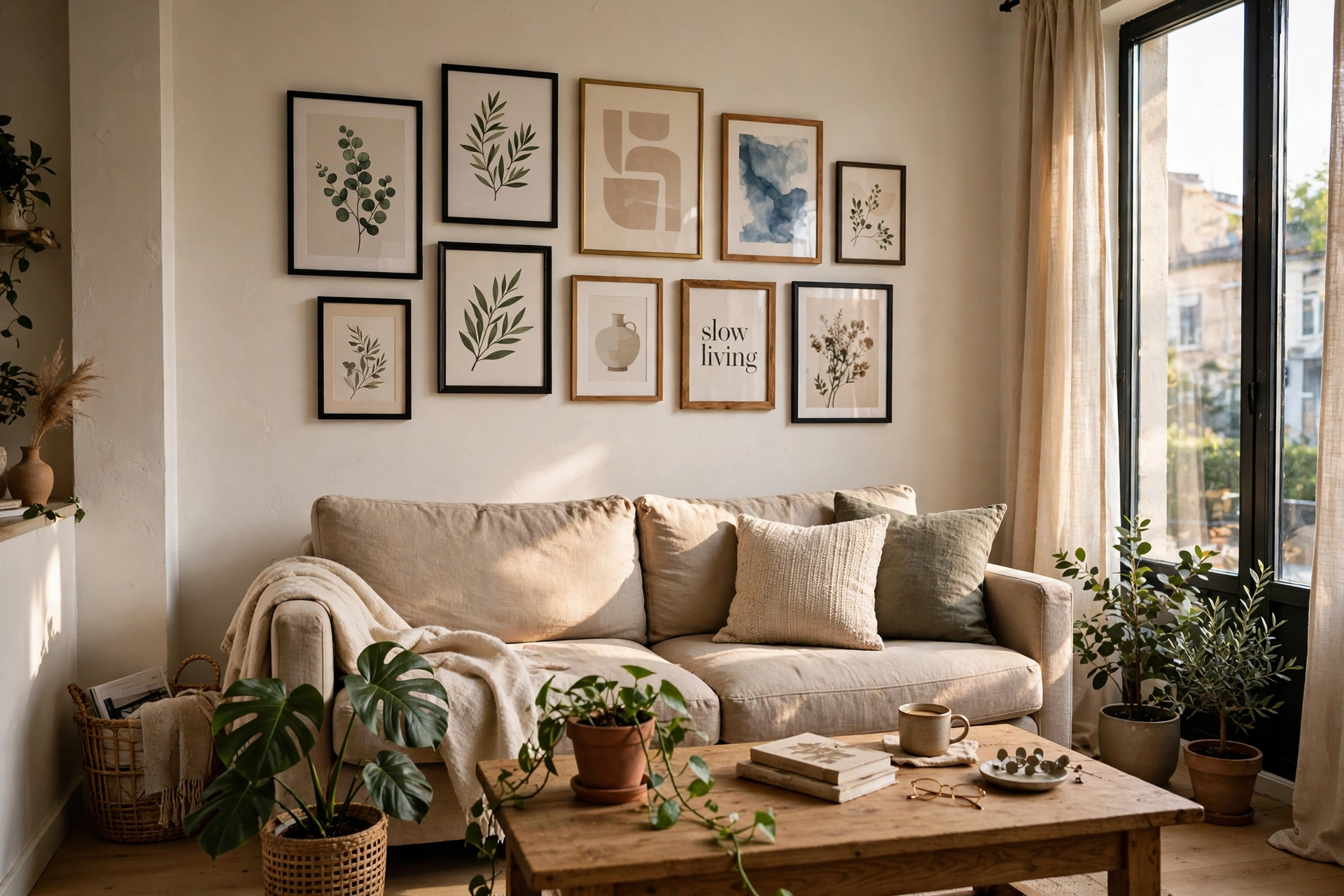

A gallery wall is the hardest working decor a small apartment can have. It costs little, it needs no floor space, it can be completely renter friendly, and it turns the one thing every small home has, a blank wall, into the most personal part of the room.
The trick is planning before hammering. A gallery wall that works in a small space has one clear system behind it: a strict grid, a salon cluster with balanced edges, a single row on a picture ledge, or a column that climbs a narrow wall. Pick the system first and the frames almost arrange themselves.
These 15 gallery wall ideas are planned for small apartments and rentals. Each one explains the layout, how to scale it to a compact wall, and the mistake that most often makes a gallery wall look messy instead of collected.
What Is the Easiest Gallery Wall Layout for a Small Apartment?
The easiest layout is a neat grid of matching frames above the sofa. Six or nine identical frames in two or three rows need no artistic eye, because the order does the work, and the wall reads calm even when the prints inside are lively.
Measure the wall first and keep the whole arrangement about two thirds the width of the furniture below it. Leave 15 to 20 cm between the sofa back and the lowest frame, and keep gaps between frames even, around 5 cm, so the grid feels like one piece.
If you rent, build the same grid with removable strips and lightweight frames. Our wider guide to apartment wall decor covers damage free hanging methods in detail, and most of these gallery wall ideas work with strips alone.
Hang a Strict Grid When You Want Calm
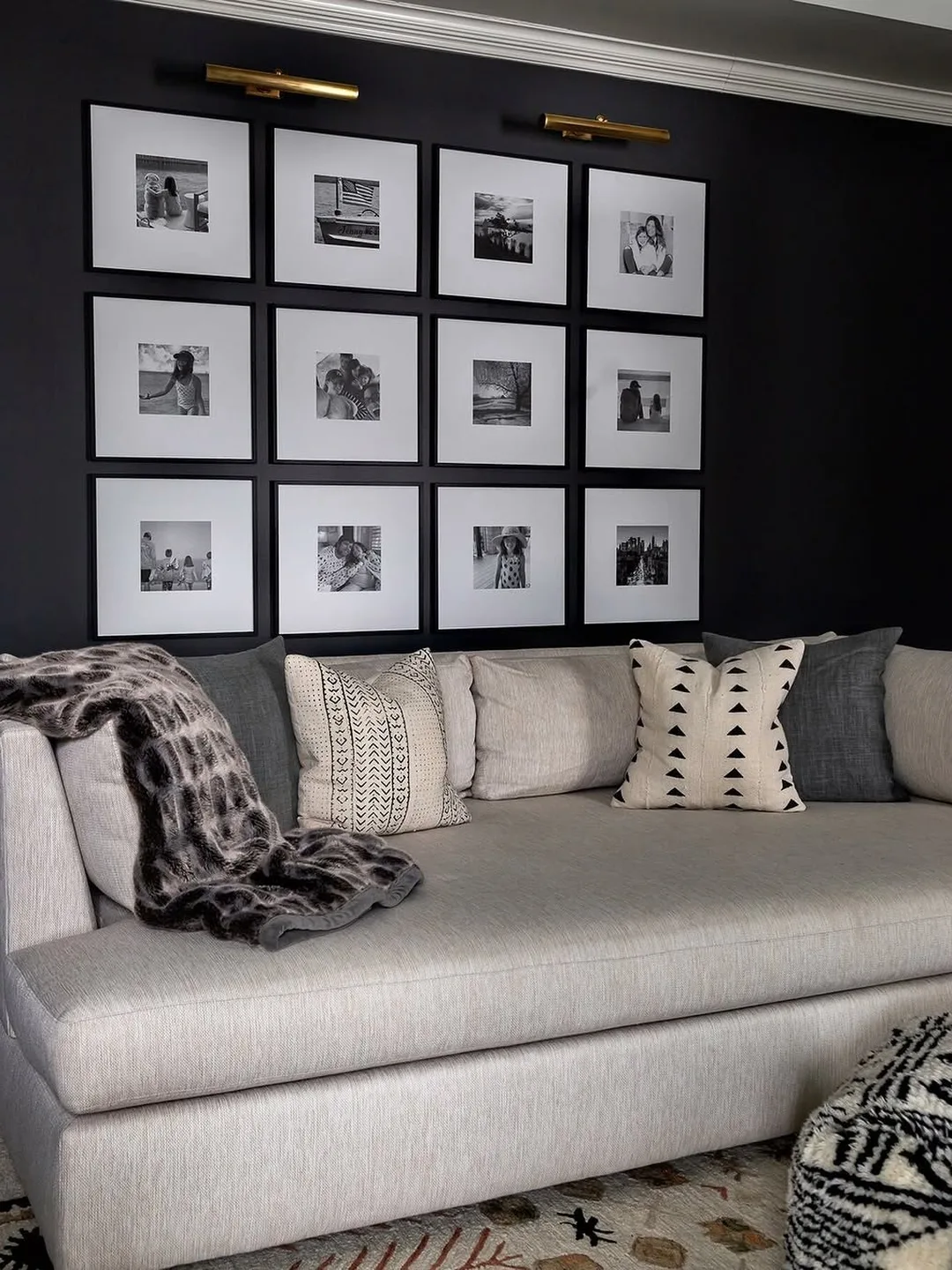
A strict grid is the calmest gallery wall there is. The living room in the photo hangs twelve black and white photos in identical white frames on a dark wall, and the repetition turns a big collection into a single quiet statement.
Grids forgive almost any content. Family photos, travel prints and postcards all settle down when the frames match and the spacing is exact, which makes the grid the safest first gallery wall for a small room.
Use a level and painter’s tape to mark every position before the first nail or strip. A grid lives or dies on alignment, and five minutes of taping saves a wall full of almost straight frames.
Keep the prints inside one family too, all black and white, all landscapes, or all one color story. The frames provide the order, and matching content doubles the calm.
The common mistake is a grid that is too small for the wall. Twelve modest frames beat four large ones here, because the grid needs enough repeats to read as a pattern rather than a few pictures in a row.
Print shops and photo apps make grids easy to plan, because you can order every print in the same size and finish in one batch. Order one spare print as well, so a damaged or faded piece never breaks the pattern later.
Build a Salon Style Cluster Above the Sofa
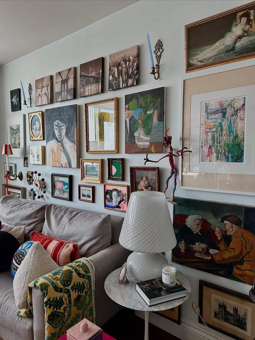
The salon cluster is the classic gallery wall: frames of many sizes fitted together like a puzzle above the sofa. The room in the photo mixes paintings, prints and photographs edge to edge, and it works because the outer edges form one loose rectangle.
Start with the largest piece slightly off centre, then fill around it with medium frames, and use the smallest frames as grout in the gaps. Keep spacing tight and even, around 3 to 5 cm, so the cluster reads as one artwork.
Lay the whole arrangement on the floor or on paper templates first. Photograph it, adjust it, and only then hang. Salon walls reward patience more than any other layout in this list.
The common mistake is spreading the cluster too wide and thin. A dense cluster above the middle of the sofa looks richer than the same frames scattered across the whole wall.
Lean Big Frames Instead of Hanging Them
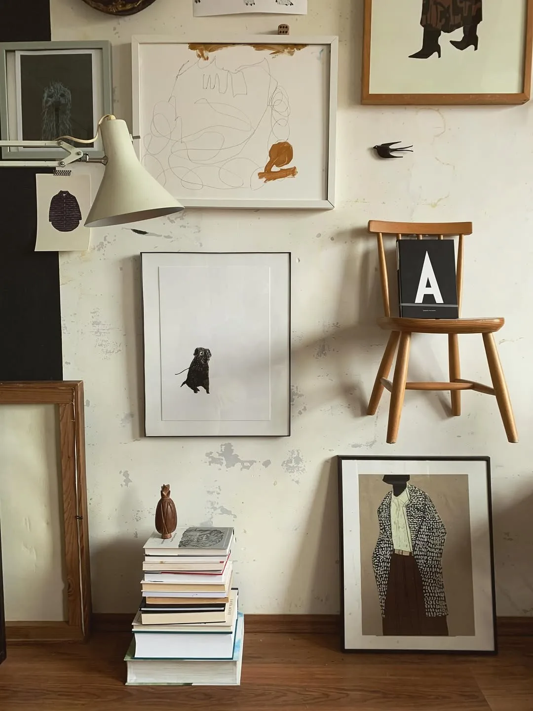
Leaning frames give a gallery wall with zero holes. The corner in the photo layers large frames on the floor against the wall and mixes them with smaller hung pieces and a stack of books, and the result feels like an artist’s studio rather than a showroom.
Leaning works best with one or two large frames, at least 60 cm tall, overlapped slightly by a smaller frame in front. The overlap is what makes it look deliberate instead of stored.
Renters love this layout because it moves in minutes. Restyle it for seasons, swap the front frame, or clear it entirely when you need the wall back, and nothing needs filling or painting.
Safety matters with leaning glass. Keep large frames out of walkways, rest them on a non slip surface, and in homes with small children use a discreet safety strap at the top even for leaned pieces.
The common mistake is leaning small frames, which just look like clutter waiting to be hung. Save leaning for the big pieces and hang or shelve the small ones.
Turn a Plain Hallway Into a Slow Gallery
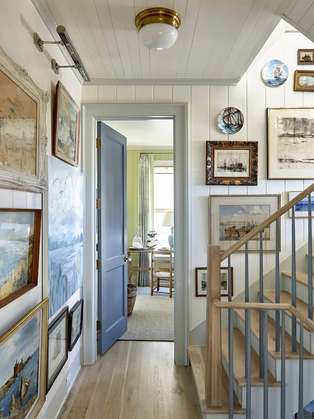
Hallways are the most wasted walls in small apartments, and they make wonderful galleries. The hallway in the photo lines both sides with framed pieces at eye level, turning a walk to the bedroom into a small exhibition you pass ten times a day.
Hallway galleries can be denser than living room ones, because you see them up close and one piece at a time. Mix sizes freely, keep the frames slim so nothing catches a shoulder, and light them with the existing ceiling light or a battery picture light.
Keep a rough height line so the walk feels calm. Frames can vary in size, but if their centres sit near one line, the corridor reads as a gallery rather than a jumble.
The common mistake is hanging pieces too high in a narrow hall. Eye level in a hallway is slightly lower than in a living room because you stand closer, so centre the main pieces around 145 cm from the floor.
A hallway gallery also hides the scuffs and marks that narrow walls collect. Frames cover the damage honestly, and the corridor that looked tired starts to look curated, which is a gift in a rental you cannot repaint.
Go Floor to Ceiling on One Brave Wall
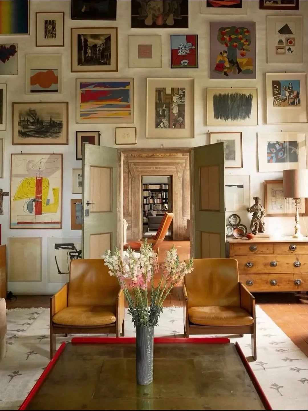
One wall in a small apartment can carry a full floor to ceiling gallery if the rest of the room stays quiet. The room in the photo covers a whole wall with frames of every size, and the effect is a rich, warm backdrop rather than chaos.
This layout eats frames, so it suits collectors and thrift shoppers. Fill gaps with small prints, postcards and even empty vintage frames while the collection grows, and let the wall evolve over months instead of buying it in a weekend.
Keep furniture against the gallery wall low and plain. In the photo, simple leather chairs and a low table let the wall do all the talking, and that contrast is what stops the room tipping into visual noise.
The common mistake is starting a second busy wall. Floor to ceiling is a one wall commitment. The other walls should hold one piece at most, or stay empty and let the gallery breathe.
Print Your Own Photos for a Wall That Feels Personal
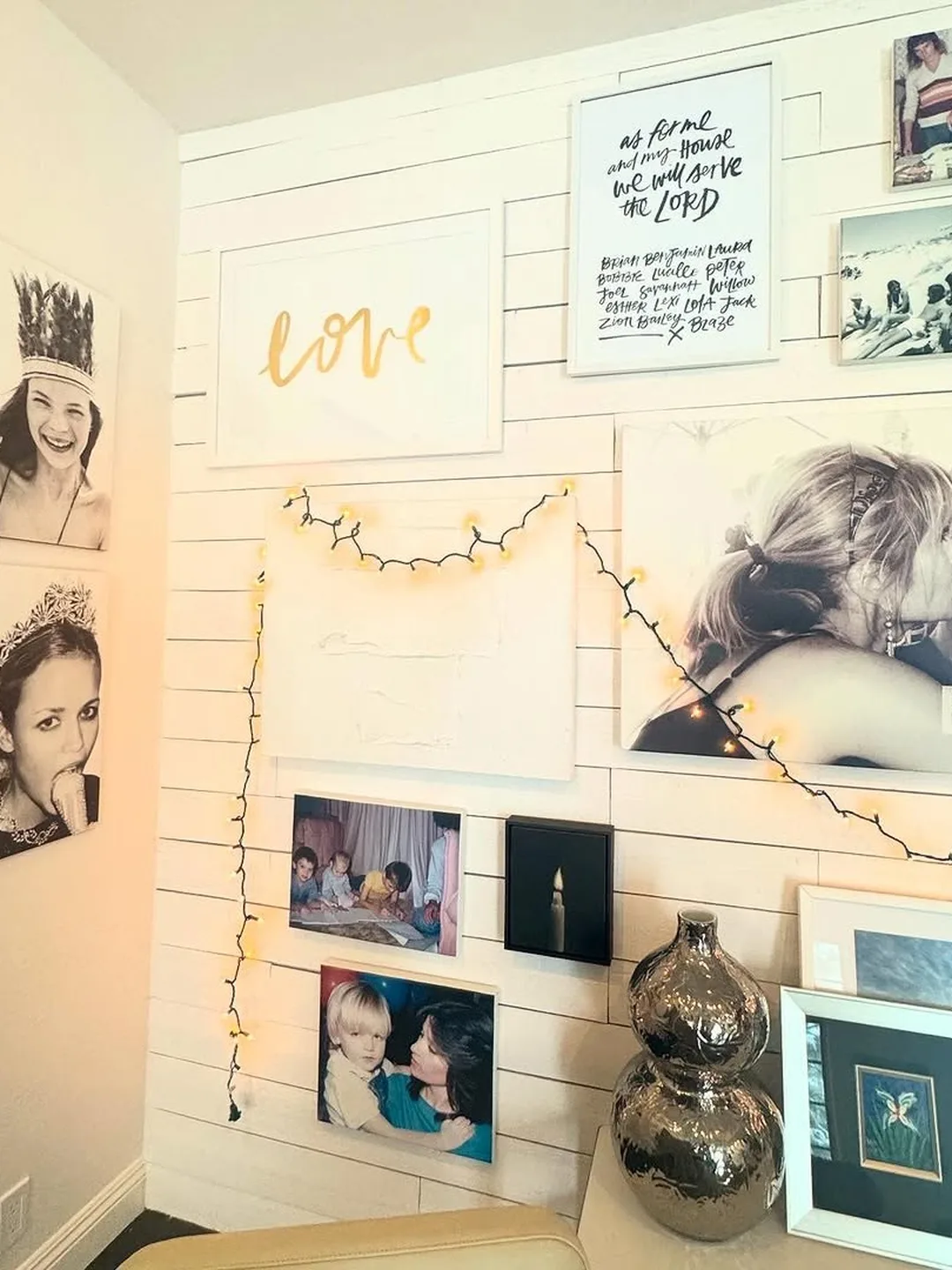
The most loved gallery walls are rarely the most stylish ones. The photo wall in the photo mixes family canvases, snapshots and string lights on white panelling, and it works because every image means something to the people who live there.
Print bigger than you think. Phone photos look weak as tiny prints in a crowd, but one or two large canvases or framed enlargements anchor the wall and give the small prints something to gather around.
Keep one element consistent so personal photos still look planned. Matching frame colors, all white mounts, or a shared warm filter across the prints will tie a decade of different cameras together.
Renters can build this wall with clips, washi tape borders or a corkboard painted to match the wall. Our empty wall decor guide has more no damage ways to fill a blank wall with meaning.
The common mistake is printing everything the same small size. A wall of identical little rectangles reads as a noticeboard. Vary the sizes, lead with two big pieces, and the wall becomes a story.
Repeat One Frame Color for Instant Order
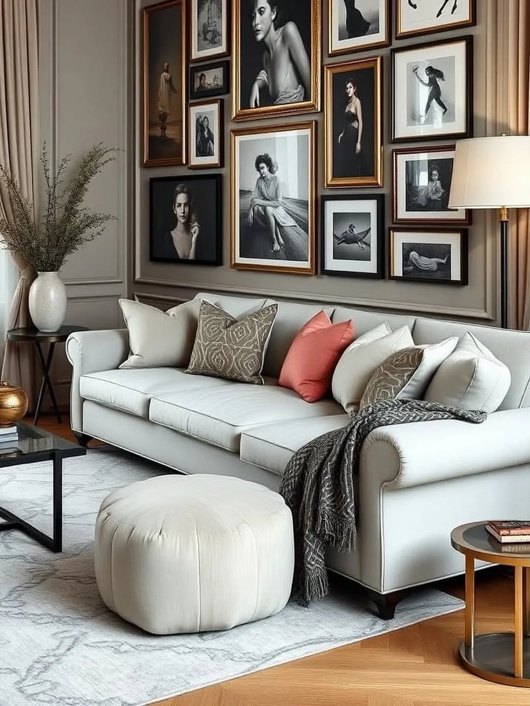
When the art is varied, let the frames do the organising. The living room in the photo hangs portraits and prints in slim black frames above a pale sofa, and the single repeated color pulls very different images into one elegant arrangement.
Black is the classic choice, but white, natural oak or thin gold all work the same way. What matters is commitment: every frame in the arrangement shares the color, with no strays.
This is also the cheapest way to use thrifted frames. Buy mismatched frames for almost nothing, paint them all one color on a Saturday, and the set looks bought together from a gallery shop.
The common mistake is mixing frame colors and frame widths and art styles all at once. Choose one thing to vary. If the frames match, the art can roam; if the art matches, the frames can vary slightly.
White mounts inside every frame strengthen the effect. A wide mount gives small prints the presence of larger art, calms busy images, and adds a second layer of repetition that makes mixed collections look expensive.
Mix Bright Art When the Furniture Stays Plain
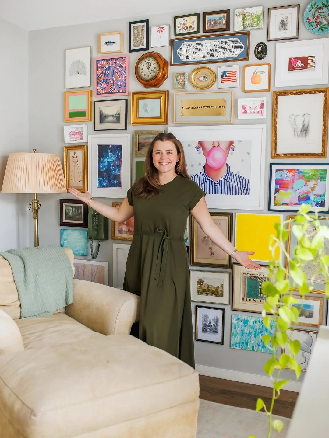
A gallery wall can be the color in a calm room. The wall in the photo is a joyful patchwork of bright prints and paintings above plain seating, and it works because the sofa and cushions below stay quiet and let the art sing.
This is a smart plan for renters who cannot paint. The wall delivers the color personality of a painted room, and when you move, the color rolls up and travels with you.
Keep one thread running through the bright pieces, a repeated color, a shared subject like faces or flowers, or mostly warm tones. A thread stops a colorful wall becoming a random one.
The common mistake is adding colorful cushions, a colorful rug and a colorful throw to compete. Let the gallery be the single loud voice in the room and it will sound like music instead of noise.
Mix Objects Between the Frames
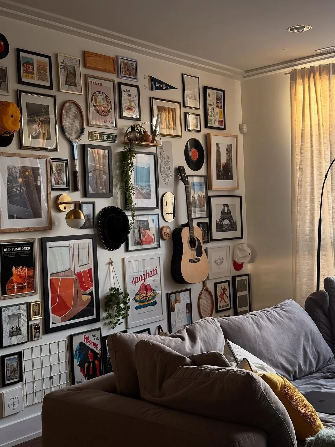
Frames do not have to travel alone. The corner in the photo mixes paintings with a guitar, mirrors, plates and small shelves, and the objects give the wall a collected, lived in depth that flat frames cannot reach.
Good mix ins include a small round mirror, a woven plate or basket, a tiny shelf with a plant, a clock, or an instrument you actually play. Keep objects light and fix them as carefully as the frames.
Objects also solve the odd gap problem in salon layouts. When two frames leave an awkward hole, a small object fills it with more charm than a forced tiny print.
The common mistake is objects that stick out too far in a small room. Keep everything within about 8 cm of the wall so the arrangement reads as one skin, not a shelf accident.
Build the Gallery Around the TV
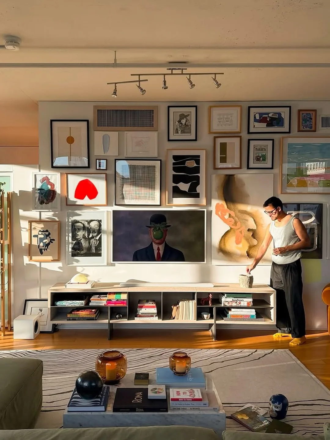
A television is a big black rectangle that most gallery walls pretend not to see. Building the gallery around it, as the salon wall in the photo does, turns the TV into one frame among many and the wall into a designed whole.
Treat the screen as the largest picture in the arrangement. Hang frames around it with the same spacing you use elsewhere, and include one or two pieces as dark or as bold as the screen so it does not sit alone.
This layout suits small living rooms where the TV wall is the only big wall. Instead of fighting for a second wall, the gallery and the TV share one, and the room gains art without losing function. More layouts like this appear in our apartment living room TV wall designs guide.
The common mistake is frames crowding the screen edges. Leave a clear margin around the TV, roughly the same as your frame spacing doubled, so the screen still reads as a screen when it is on.
Cable discipline decides whether this wall looks designed. Run cables inside the wall only if your lease allows it; otherwise use a painted cable cover in the wall color, and keep consoles inside a closed bench below the screen.
Give the Bathroom a Small Gallery Too
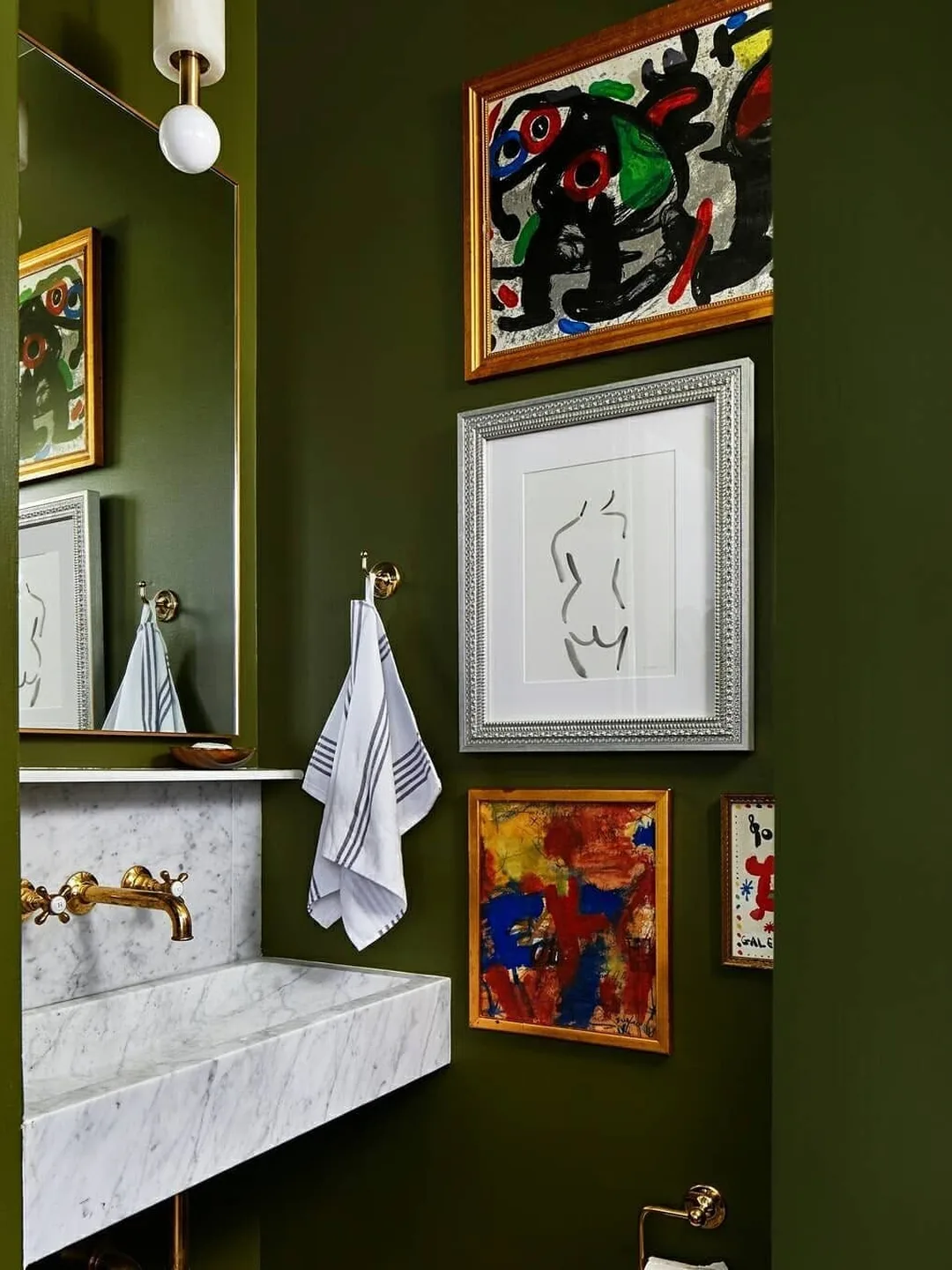
Bathrooms are small, steamy and usually decorated last, which makes them perfect for a mini gallery. The bathroom in the photo hangs bold art on deep green walls above the sink, and the room suddenly feels designed instead of purely practical.
Choose pieces that can handle humidity. Framed prints behind glass, canvas, metal or ceramic pieces survive bathroom steam far better than unframed paper, and cheap frames mean you can rotate art without worry.
A bathroom gallery needs only three to five pieces. Group them on the wall you face from the door or above the towel rail, and keep them clear of direct splash zones.
The common mistake is precious original art in a steamy room. Save the valuable pieces for dry walls and let the bathroom host prints, posters and finds you can replace for a few coins.
Let the Arrangement Stay Loose and Asymmetric
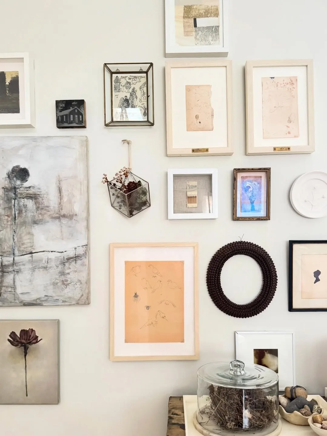
Not every gallery wall needs a system you can name. The arrangement in the photo drifts across the wall in loose balance, mixing frames, a wreath and small shelves, and it feels relaxed because the spacing stays generous and the palette stays soft.
Loose walls work when the colors are quiet. Pale art, natural frames and lots of white space between pieces keep an asymmetric layout airy instead of messy, which suits calm styles like the rooms in our japandi apartment decor ideas guide.
Build a loose wall slowly. Hang the biggest piece, live with it for a week, then add the next. Walls built over time find their own balance in a way weekend installations rarely do.
The common mistake is loose arrangement plus loud art plus tight spacing. Pick two of the three at most. Loose and loud needs space; loose and tight needs quiet art.
Use Poster Sets for a Soft Matched Look
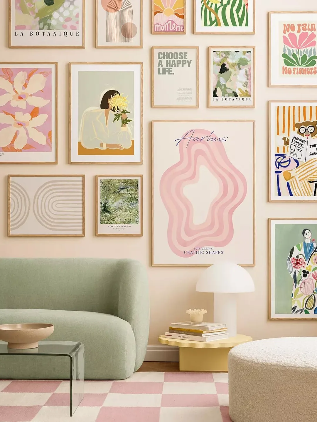
Poster sets are the shortcut gallery wall. The arrangement in the photo uses a coordinated set of pastel prints in matching frames above a reading chair, and the whole wall looks designed by one hand, because it was.
Sets suit small apartments because the thinking is done. Choose a set whose colors already live in your room, hang them in a loose grid or a gentle cluster, and the wall is finished in an afternoon.
Thin frames keep poster walls light, literally and visually. In a rental, a full wall of slim poster frames can hang from removable strips with no single heavy fixing.
The common mistake is a set that matches nothing else in the home. Pull one color from the set into a cushion or a throw, and the wall joins the room instead of floating above it.
Poster sets also solve the gift problem in a small home. One set refreshes a whole wall for the price of a single framed print, and the old set stores flat in a drawer or behind the sofa until you want it back.
Group Four Matching Frames Beside a Reading Chair
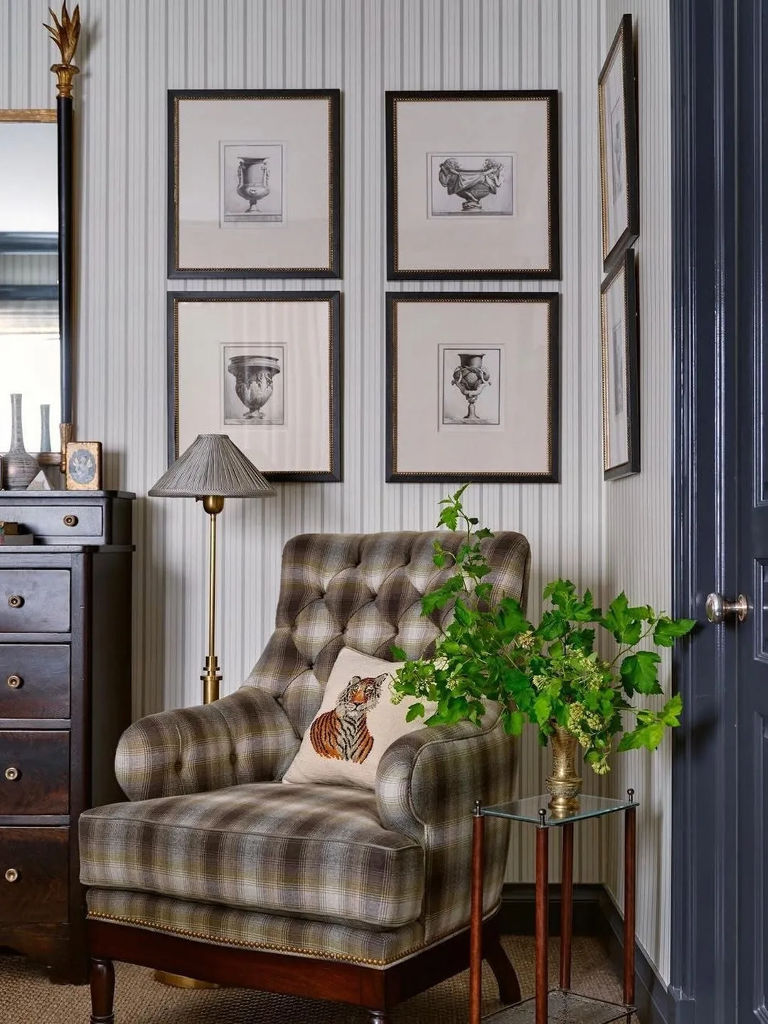
A gallery wall does not need a sofa or a big wall. The corner in the photo groups four matching frames in a square beside a plaid armchair, and that small, neat arrangement turns a leftover corner into the most finished spot in the room.
Four frame groups suit the small walls apartments actually have: the slice beside a door, the wall above a desk, the corner by a window. Anywhere a single picture looks lonely, a square of four looks intentional.
Matching frames and matching mounts do the work here. The prints can be anything, sketches, photos, pressed leaves, as long as the presentation repeats exactly.
The common mistake is hanging the group too high. A corner group should centre near the eye level of the person sitting in the chair beside it, lower than a standing gallery, so it belongs to the seat.
Stack a Narrow Column in the Entryway
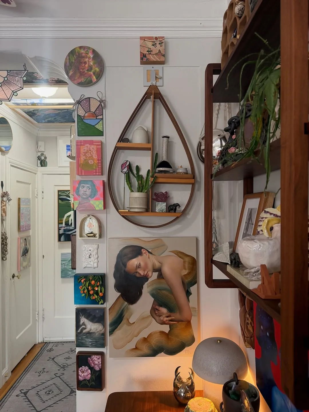
Every apartment has one narrow strip of wall that fits nothing. A vertical gallery column, like the one climbing the entry wall in the photo, turns that strip into a feature and greets you at the door.
Columns work with mixed small frames stacked with even gaps, roughly following the width of the strip. Keep the column centred on the strip and let it run from just above the skirting to near the ceiling for full effect.
Entryway columns are a kind home for the pieces that never fit elsewhere: the small print, the odd shaped frame, the single postcard you love. Gathered in a column, leftovers look like a collection.
The common mistake is a column that wanders. Mark a straight vertical line with tape before hanging, because the eye forgives mixed frames but never forgives a drifting line.
Common Gallery Wall Mistakes to Avoid
Hanging Everything Too High
The centre of a gallery wall should sit near eye level, around 145 to 150 cm from the floor, and lower above furniture. Walls hung for giants make small rooms feel like waiting rooms.
Skipping the Paper Template Step
Cut paper to the size of each frame, tape the arrangement to the wall, and live with it for a day. This one step prevents most crooked, crowded and badly spaced gallery walls.
Using Frames That Are Too Small
Tiny frames on a big wall read as clutter. In small rooms the answer is not smaller art, it is fewer, larger pieces with confident spacing between them.
Ignoring the Furniture Below
A gallery wall belongs to the furniture under it. Keep the arrangement narrower than the sofa or console, centred on it, and close enough to it that the two read as one composition.
Mixing Every Frame Style at Once
Variety needs a limit. If frame colors, widths, art styles and subjects all vary together, the wall looks accidental. Fix at least one of them and let the rest play.
Forgetting About Light and Glare
Glass frames opposite a window can mirror the room instead of showing the art. Check each position at the brightest time of day, and use non reflective acrylic where glare wins.
Budget-Friendly Gallery Wall Tips
Thrift the frames and print the art. Charity shops sell solid wooden frames for coins, and a coat of one paint color unifies any haul. Free printable art, your own photos and pages from old books fill them for almost nothing.
Start with the wall you see most and grow slowly. A gallery wall built over six months of finds looks more collected and costs less per month than a set bought in one weekend.
Use one large cheap piece as the anchor. A big poster in a simple frame costs little and gives smaller thrifted pieces something to orbit, so the wall looks planned from day one.
Removable strips cost more per hook than nails, but they save the deposit. Budget for strips on the largest frames and use nails only where your lease clearly allows them.
Swap art inside the frames before buying new frames. A fresh print in an old frame changes the wall for the price of a coffee, and rotating art seasonally keeps the room feeling new.
Keep a small reserve of spare prints in a drawer. When a frame breaks or a print fades, the wall heals in minutes instead of waiting for the next shopping trip, and the arrangement never sits unfinished.
A Weekend Plan to Hang Your First Gallery Wall
Saturday morning is for measuring and collecting. Measure the wall, note the furniture width, gather every frame you own, and lay the arrangement on the floor. Photograph three versions and choose with fresh eyes after lunch.
Saturday afternoon, cut paper templates and tape the winning layout to the wall. Adjust heights against the furniture, check the view from the doorway and from the sofa, and mark every fixing point in pencil.
Sunday is hanging day. Work from the centre piece outward, check each frame with a level, and step back after every two frames. Small corrections early save a wall of tilted frames later.
Finish by styling the furniture below. A lamp, a plant or a stack of books at one end of the sofa echoes the wall and ties the composition together, and then the wall is ready to live with and grow.
FAQ
How high should a gallery wall be above a sofa?
Leave 15 to 20 cm between the top of the sofa back and the lowest frame. The wall and the sofa should read as one group, so if you can fit a hand and a half between them, the height is about right.
How do renters hang a gallery wall without nails?
Use removable picture strips rated above each frame’s weight, keep frames lightweight with acrylic instead of glass, and consider leaning, ledges and columns that need one fixing at most. Always clean the wall spot with alcohol first so strips grip properly.
How many frames does a gallery wall need?
Three frames can start a group, five to nine make a confident small wall, and grids often use nine or twelve. Odd numbers arrange more easily in clusters, while grids prefer even rows. Start with what you own and add slowly.
Should all the frames match?
They do not have to, but matching one thing helps. Either match the frames, match the mounts, or match the art’s color family. Salon walls mix frames freely, yet they still keep spacing and outer edges disciplined.
What should I put in the frames?
Anything flat and loved: prints, photos, postcards, fabric scraps, pressed leaves, children’s drawings, maps and pages from damaged old books. Personal pieces make the wall yours, and cheap pieces make it fearless to change.
Can a gallery wall make a small room feel bigger?
Yes, when it draws the eye up or along a wall. A column or a floor to ceiling arrangement stretches a room vertically, while a wide calm grid above a sofa makes the wall feel wider. Busy small clusters at eye level do the least for space.
Conclusion
A gallery wall gives a small apartment something no furniture can: personality that takes no floor space. Whether you choose a strict grid, a salon cluster, a hallway line or a single brave floor to ceiling wall, the system matters more than the art, and the planning matters more than the spending.
Start with the wall you see every day, use the frames you already own, and tape before you hang. Add pieces as you find them and let the wall grow with your life in the home. That slow, collected growth is exactly what makes gallery walls worth having.